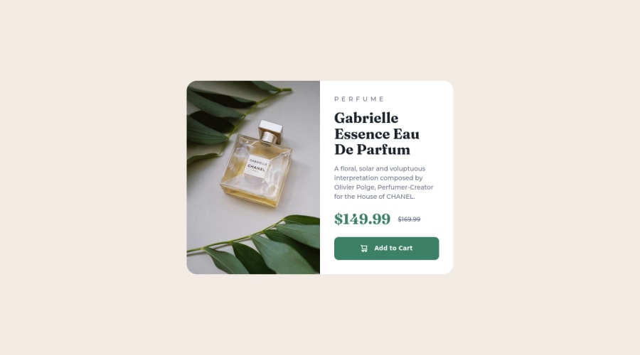
Design comparison
SolutionDesign
Community feedback
- @carloseag1609Posted over 2 years ago
Nice! I think your solution has rounder corners than the original design but its okay. In the html, you could change the
<p>tag for a<span>inside the<button>, because buttons can only have inline elements as children. Anyways, I found your HTML and CSS code readable and structured as well.Marked as helpful0@lemmoorPosted over 2 years agoThanks for the feedback! Didn't know about inline elements only inside buttons.
0
Please log in to post a comment
Log in with GitHubJoin our Discord community
Join thousands of Frontend Mentor community members taking the challenges, sharing resources, helping each other, and chatting about all things front-end!
Join our Discord
