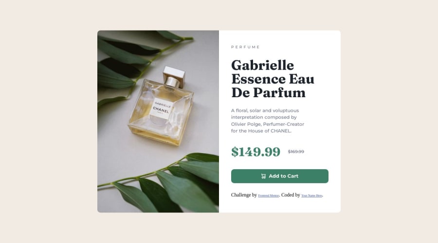
Product preview card component (Html, Css, Mobile First)
Design comparison
Solution retrospective
I would greatly appreciate your feedback on my project so that I can make improvements. Thank you in advance for taking the time to share your thoughts with me.
Community feedback
- @waad2lfPosted almost 2 years ago
Well done your solution looks awesome, But your work looks a little bigger than the design, It's very good to compare your work with the design. Also, the footer (challenge by.....) should be outside and under the project.
Marked as helpful1 - @fernandolapazPosted almost 2 years ago
Hi 👋🏻, in case you want to take a look:
HTML / ACCESSIBILITY:
- It would be better to capitalize 'Perfume' with CSS (using
text-transform: uppercase;) and not in HTML. Some screen readers will read out uppercased text as individual letters.
- The icon is a decorative image and therefore need an empty
altattribute to be ignored by a screen reader.
- Consider leaving the <footer> outside of the <main>.
CSS:
- If you look between 700 and 760px there is a white space below the image, you can easily fix it with
height: 100%
I hope it’s useful : )
Regards,
Marked as helpful1 - It would be better to capitalize 'Perfume' with CSS (using
Please log in to post a comment
Log in with GitHubJoin our Discord community
Join thousands of Frontend Mentor community members taking the challenges, sharing resources, helping each other, and chatting about all things front-end!
Join our Discord
