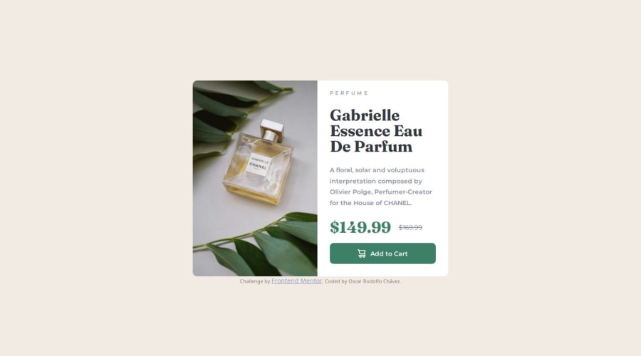
Product preview card component [HTML & CSS]
Design comparison
Community feedback
- @jesse-kroonPosted 5 months ago
Hi there,
Your solution looks great! Upon checking your code I noticed you use a lot of divs, while there could be more semantic html elements used. So I think you could improve on that. That will also improve the accessibility.
Also, I think you need to define the mobile breakpoint earlier, when testing I notice that it takes quite some width before the breakpoints hits, making a big piece of the component overflow the screen before switching to the mobile version.
Your code is well-readable and the overall product looks very close to the design. So it's up to you if you want to fine-tune the rest, either way: great job!
Marked as helpful0
Please log in to post a comment
Log in with GitHubJoin our Discord community
Join thousands of Frontend Mentor community members taking the challenges, sharing resources, helping each other, and chatting about all things front-end!
Join our Discord
