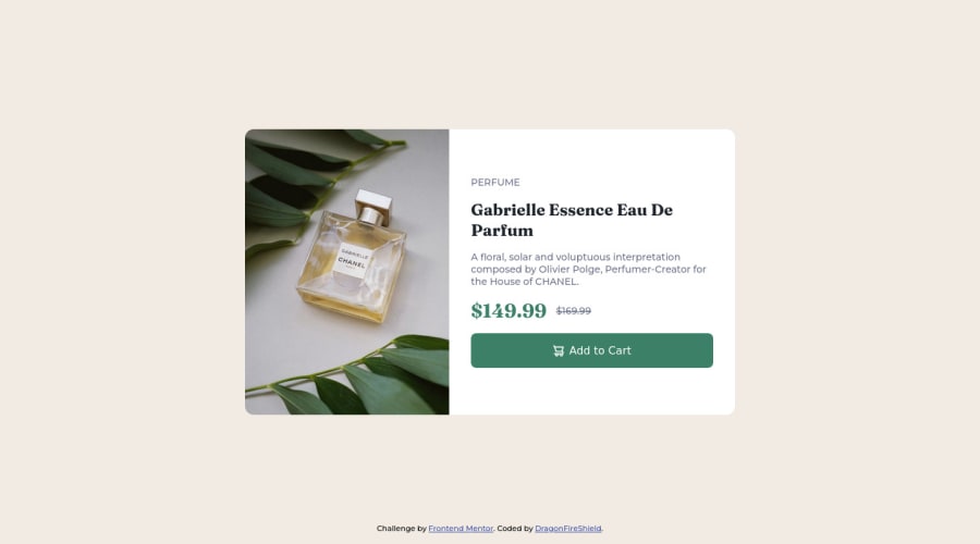
Not Found
Not Found
Not Found
Not Found
Not Found
Not Found
Not Found
Not Found
Not Found
Not Found
Not Found
Not Found
Not Found
Not Found
Not Found
Not Found
Not Found
Not Found
Not Found
Not Found

Submitted

Product preview card component

@DragonFireShield

Desktop design screenshot for the Product preview card component coding challenge

This is a solution for...

  • HTML
  • CSS
1newbie
View challenge

Design comparison


SolutionDesign

Solution retrospective


At first it only worked on Safari, but after a quick update it now works for chromium browsers too. I still find it a bit confusing to work with images and proper layout. Looking for some tips on where I can improve!

Community feedback

@VCarames

Posted

Hey there! 👋 Here are some suggestions to help improve your code:

  • Apply the following code to have each side take up the equal amount.

Code:

 (component-container) > * {
        flex-basis: 50%
    }
  • Change the width of the .card to max-width 600px to better match the FEM example.

  • For this challenge you want to use the Picture Element not the Background Image Property. The Background Image Property is mainly used on decorative images

Picture Element will allow your to switch between images in different breakpoints and makes your site load faster by saving bandwidth.

Here is an example of how it works: EXAMPLE

Syntax:

  <picture>
    <source media="(min-width: )" srcset="">
    <img src="" alt="">
  </picture>

More Info:

https://www.w3schools.com/html/html_images_picture.asp

https://web.dev/learn/design/picture-element/

  • Once you fix the image implementation, you will want to include an Alt text tag with them. Inside that Alt Tag you want to describe what the image is; they need to be readable. Assume you’re describing the image/icon to someone.

  • The old price 🏷 is not being announced properly to screen readers. You want to wrap it in a Del Element and include a sr-only text explaining that this is the old price.

  • Your content is not fully responsive. Here is a link to Google Developer’s site that will teach you how make it 100% responsive:

https://web.dev/learn/design/

If you have any questions or need further clarification, let me know.

Happy Coding! 👻🎃

1

@DragonFireShield

Posted

@vcarames Thanks for this amazingly helpful comment! I will try to improve on this tomorrow.

0

@VCarames

Posted

@DragonFireShield

Glad I could help! Keep it up!

0
ArthurS 140

@art5551

Posted

Looks good. I would recommend adding a max-width so the text and button don't stretch. I suggest you explore the flex attributes to center your content. For example, body { min-height: 100vh; display: flex; justify-content: center; align-items: center; } I am relatively new to frontend but flex is awesome.

0

@DragonFireShield

Posted

@art5551 Thanks, I will check out the width settings, I'm sure that no stretch looks better. Also, in my next challenge I actually used flex to center it completely! I like it way better because it leaves me free to use transform for other stuff. (I know how to center with position and transform, but got issues when working with transform scale etc after doing so)

0

Please log in to post a comment

Log in with GitHub
Discord logo

Join our Discord community

Join thousands of Frontend Mentor community members taking the challenges, sharing resources, helping each other, and chatting about all things front-end!

Join our Discord