

Design comparison
SolutionDesign

Solution retrospective
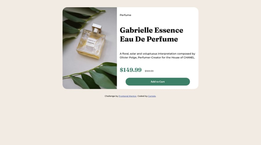
First responsive layout project and first attempt at a mobile-first workflow. This project is far from perfect; there are several sizing, spacing issues. I am hoping to receive feedback so I can improve.
Please log in to post a comment
Log in with GitHubCommunity feedback
No feedback yet. Be the first to give feedback on Chris's solution.
Join our Discord community
Join thousands of Frontend Mentor community members taking the challenges, sharing resources, helping each other, and chatting about all things front-end!
Join our Discord