Design comparison
Solution retrospective
For this project, this is my first time utilizing flexbox to create the layout. I find it very useful as it keeps the layout neat and organized. Overall, I find myself getting better with CSS with each project. This is also my first time using the mobile first approach. It not only makes the CSS code more efficient but also organized when it comes to adding CSS code for the desktop version without repeating code. I am learning how to create a gameplan on how to approach common UI components such as dialog boxes and others so that it will be useful for future projects. It will also speed up development time as well.
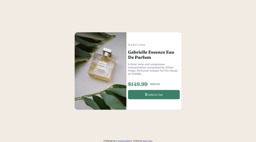
What challenges did you encounter, and how did you overcome them?One of the challenges I encountered was to ensure smooth transition from mobile to desktop. I've noticed some padding issue with the perfume image but I was able to modify the margins accordingly for the width of the card content with product information. Overall I find this project fun and challenging.
What specific areas of your project would you like help with?What I hope to improve on this project is for the desktop view, I would like to improve the padding and perfume image in the card so that when the user shrinks and expands the width, it would not leave extra space. Right now I am using lower margins on the card component product details to resolve this extra space issue for the perfume image.
Please log in to post a comment
Log in with GitHubCommunity feedback
No feedback yet. Be the first to give feedback on Sean Chen's solution.
Join our Discord community
Join thousands of Frontend Mentor community members taking the challenges, sharing resources, helping each other, and chatting about all things front-end!
Join our Discord
