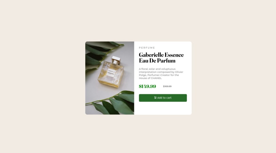
Design comparison
SolutionDesign
Please log in to post a comment
Log in with GitHubCommunity feedback
- @ruancostacampos
Here in mobile version its showing the desktop version and vice-versa.
Marked as helpful - @ruancostacampos
Hi, looks better now! Good job. I think with your knowledge you can do two things who i'll make your finish the design 1- Show the mobile content when the screen width is minor than desktop card 2- Adjust the mobile image to correct size on the mobile card version.
You can do it! practice leads to perfection
Join our Discord community
Join thousands of Frontend Mentor community members taking the challenges, sharing resources, helping each other, and chatting about all things front-end!
Join our Discord
