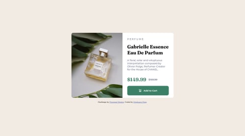
Submitted almost 3 years agoA solution to the Product preview card component challenge
Responsive Product Card Using Flexbox
foundation

@mekoness
Solution retrospective
I just started working with media queries and I am still struggling with the breakpoint from mobile to desktop layout. Should I add an in-between breakpoint as well for medium sized screens as well?
Code
Loading...
Please log in to post a comment
Log in with GitHubCommunity feedback
No feedback yet. Be the first to give feedback on Stephanie's solution.
Join our Discord community
Join thousands of Frontend Mentor community members taking the challenges, sharing resources, helping each other, and chatting about all things front-end!
Join our Discord