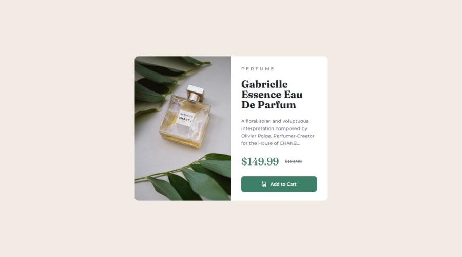
Product preview card component


Design comparison

Solution retrospective
I'm proud of using SASS for the first time
Next time I will improve my SASS functions
What challenges did you encounter, and how did you overcome them?It was first time for me to use SASS, it looks easy, but I had to check documentation many times and spend a lot of time reading about it before I actually wrote anything
What specific areas of your project would you like help with?I would like to get help with my SCSS code, for now I don't know how many mistakes I made and what I could do better
Please log in to post a comment
Log in with GitHubCommunity feedback
- P@MikDra1
I see in your code that sometimes you have sth like this:
0.3125rem;I encourage you to set a font-size on html to 62.5%. Then one rem is equal 10px. After this your calculations would be easier because you would know that one 1rem = 10px
html {
font-size: 62.5% // It means that 1rem = 10px. From this it is easier to use rem
}

p {
font-size: 1.6rem; // Here this paragraph font-size will be 16px;
}
Hope you found this comment helpful 💗💗💗
Good job and keep going 😁😊😉
Marked as helpful - @TedJenkler
Hi Emilia,
Nice project! I noticed a few areas for improvement:
Simplify Centering: I noticed you’re using a <div> to center the page. Keep in mind that any element, including <body> and <html>, can be a flex container. By reducing unnecessary <div> elements, you can simplify your code.
Enhance Accessibility: When you need to use <div> elements, consider adding aria-labels to help screen readers understand their purpose. This will improve both accessibility and SEO.
Modularize Your SCSS: While your project might be too small for extensive SCSS modularization, consider splitting your SCSS into modular components and importing everything into one main file. This approach makes debugging and updating your code easier, especially in larger projects.
SCSS Best Practice: A good practice is to create a mixin for breakpoints, for example:
@mixin respond-to($breakpoint) { @if $breakpoint == small { // small breakpoint styles } @else if $breakpoint == medium { // medium breakpoint styles } // Add more breakpoints here }
@include respond-to(medium);
(Try experimenting with different sizes for components on tablets, desktops, and so on—you’ll quickly see how useful this can be after a few breakpoints.)
Best, Teodor
Marked as helpful


Join our Discord community
Join thousands of Frontend Mentor community members taking the challenges, sharing resources, helping each other, and chatting about all things front-end!
Join our Discord