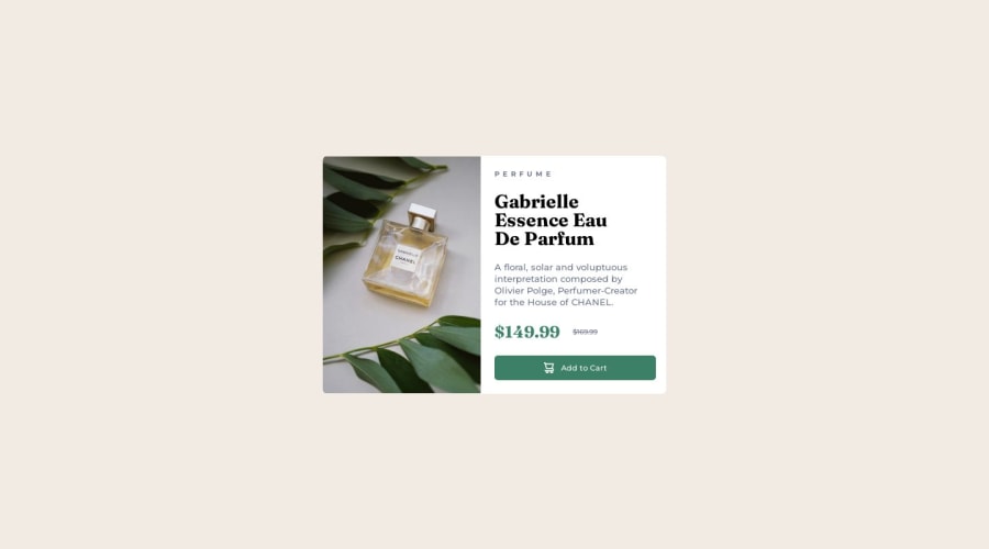


Design comparison

Solution retrospective
Hello fellow designers and developers,
I'm thrilled to present to you my solution for the Product Preview Card Component challenge on Frontend Mentor. As a passionate front-end web developer with years of experience, I've put my skills to the test to create a visually appealing and functional product preview card. Now, I'm seeking your valuable feedback to make it even better. Could you please take a moment to answer the following questions?
-
Design Charm: What aspects of the product card's design do you find visually captivating? Feel free to share your thoughts on the color palette, typography, arrangement, and any other design elements that caught your eye.
-
Navigation Ease: While interacting with the card, did you encounter any challenges in terms of navigation? If you did, I'd greatly appreciate it if you could elaborate on the difficulties you faced. This will enable me to identify any user experience hurdles.
-
Impressive Features: Were there any specific features or functionalities in the card that you found particularly useful or innovative? Your insights into what resonated with you in terms of interactivity and user engagement would be tremendously valuable.
-
User Experience Boost: In terms of user experience, what suggestions do you have to enhance the card's usability? Whether it's about optimizing the layout, improving the responsiveness, or refining the information flow, I'm eager to hear your thoughts.
-
Performance Evaluation: How would you rate the performance of the product card in terms of loading speed and responsiveness? Did you notice any delays or inconsistencies while testing it on different devices? Your feedback on performance will contribute to a seamless user experience.
-
Areas for Advancement: Were there any areas where you believe further enhancements could be made? Whether it's about refining the product details, fine-tuning animations, or any other aspect, your insights are highly valued.
I genuinely appreciate your input as it will guide me in refining this product preview card to meet the highest standards. Feel free to share your thoughts openly, and if you have additional comments or suggestions beyond the questions listed above, please don't hesitate to share them.
Thank you for taking the time to review my solution. Your feedback is incredibly valuable, and I'm excited to learn from your perspectives.
Community feedback
Please log in to post a comment
Log in with GitHub
Join our Discord community
Join thousands of Frontend Mentor community members taking the challenges, sharing resources, helping each other, and chatting about all things front-end!
Join our Discord