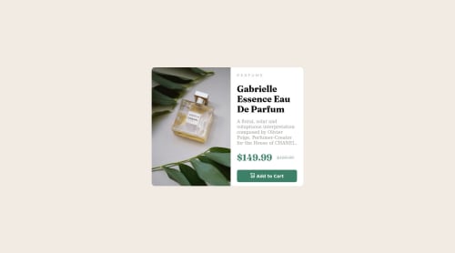
Submitted about 3 years agoA solution to the Product preview card component challenge
Landing page with Flex-box and Grid

@mariby21
Solution retrospective
First time using @media query i hope i did it.
Code
Loading...
Please log in to post a comment
Log in with GitHubCommunity feedback
No feedback yet. Be the first to give feedback on Mario Petkov's solution.
Join our Discord community
Join thousands of Frontend Mentor community members taking the challenges, sharing resources, helping each other, and chatting about all things front-end!
Join our Discord