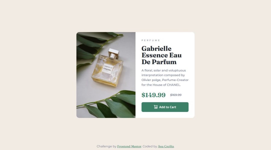


Design comparison

Community feedback
- @Reney17Posted 2 months ago
Hi book-Anlia! Great job completing the product preview card component. Here's some detailed feedback to help you further refine your solution:
Semantic HTML Strengths: If you’ve used tags like <header>, <main>, <section>, and <footer> appropriately, that’s great. Semantic HTML makes your code easier to understand and improves accessibility for screen readers. Suggestions: Ensure buttons and links have descriptive text (e.g., "Add to Cart" instead of "Click Here"). If you used <div> where a semantic element could work, consider replacing it for clarity and structure. Accessibility Strengths: If hover and focus states are distinct and visually clear, that’s a big win for accessibility. Good job if you also ensured proper color contrast and used aria-label or aria-hidden attributes where needed. Suggestions: Double-check that all interactive elements are keyboard-navigable and that form elements (if any) are labeled. Use tools like Lighthouse or Axe to test for accessibility improvements. Responsive Layout Strengths: It sounds like you’ve done a great job ensuring responsiveness. If the design works well on a range of screen sizes, especially mobile-first, that's fantastic. Suggestions: Test the layout on various screen sizes, including very small ones (e.g., 320px wide) and very large desktops. Watch for content overflow or misaligned elements. Code Quality Strengths: If your CSS is modular and you’ve used reusable utility classes, that’s excellent. Consistent naming conventions improve maintainability. Suggestions: Review your code for comments explaining complex parts and ensure it's free of redundant or unused CSS. Using tools like Prettier for formatting and ESLint for linting ensures readability. Adherence to Design Strengths: It sounds like your solution closely matches the design. Consistency in font sizes, colors, and spacing is key to a polished look. Suggestions: Revisit the design and do a pixel-perfect comparison if possible. If you deviated significantly, document your reasons for the changes (e.g., improving responsiveness or accessibility). Overall Thoughts Your solution demonstrates strong attention to detail and a clear effort to create an optimal user experience. With a few refinements—such as further accessibility improvements, ensuring pixel-perfect accuracy, and enhancing code reusability—it could be even more impressive!
If you'd like feedback on specific parts of your code or a comparison to the original design, feel free to share more details or a live demo link. Keep up the great work! 😊
Marked as helpful0

Please log in to post a comment
Log in with GitHubJoin our Discord community
Join thousands of Frontend Mentor community members taking the challenges, sharing resources, helping each other, and chatting about all things front-end!
Join our Discord