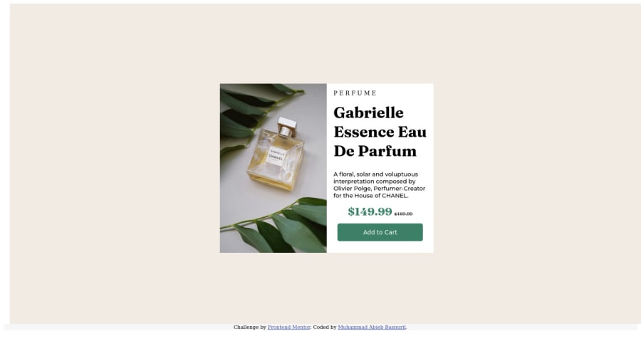
Design comparison
Solution retrospective
It is so difficult for me to set position items and make the web to be responsive,is there any practice or course that you would recommend for me? Thank you and have a good day.
Community feedback
- @PaulHazePosted about 2 years ago
Hi mate, so as the other guy said, brush up on Flex and flexbox. This tutorial really helped me:
https://flexboxfroggy.com/
I also recommend learning about the box model, particularly the difference between padding and margin.
Lastly, you can round the borders of your card with the 'border-radius' CSS property.
Keep at it mate, you'll get there...
Marked as helpful0@AbibGuardian50Posted about 2 years ago@PaulHaze Alright mate,thank you for your help and i will check on it
0 - @fritzadelbertusPosted about 2 years ago
Hello @AbibGuardian50. First of all, congratulations on finishing this challenge!
I'm also a newbie but here are some suggestion I can give:
- Using
<picture>
tag is a better practice in this challenge where the image source change according to the screen width. - I recommend using semantic HTML such as
<main>
to wrap up the main content. - The spacing in PERFUME can be easily modified in css using the
letter-spacing
property
To get a better grasp in creating layouts and position items I recommend understanding the box model (padding & margins) as well as how to use flexbox. W3Schools also provide clear documentation to learn basic CSS
I hope it's helpful and happy coding!
Marked as helpful0@AbibGuardian50Posted about 2 years ago@fritzadelbertus Thank you,i will check on it Have a great day !
0 - Using
Please log in to post a comment
Log in with GitHubJoin our Discord community
Join thousands of Frontend Mentor community members taking the challenges, sharing resources, helping each other, and chatting about all things front-end!
Join our Discord