Design comparison
SolutionDesign
Solution retrospective
Feedback welcome !
Checklist:
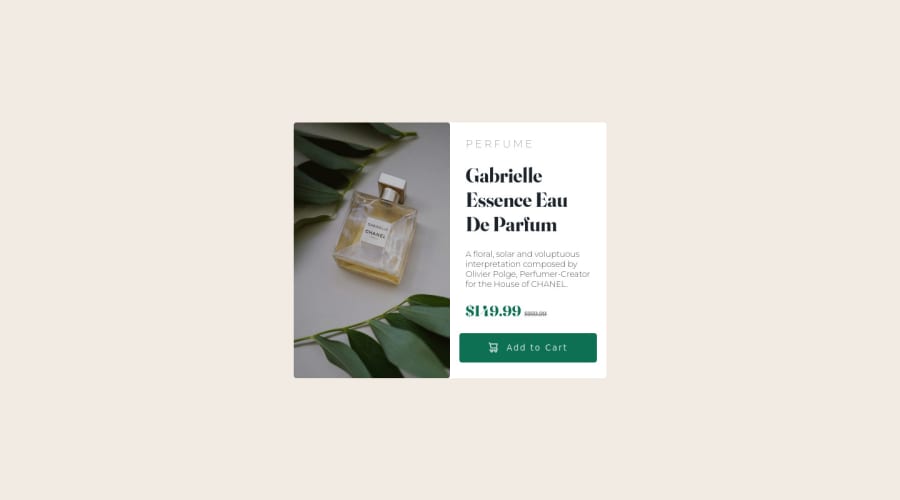
- What did you find difficult while building the project? I struggled making the page mobile responsive, the text elements kept leading to the button being overflown outside the container.
- Which areas of your code are you unsure of? I'm unsure about the usage of my media selectors as I am fairly new to that concept 3.Do you have any questions about best practices? What's best way to make this page as responsive as possible? I mean it in terms of both how to make the font responsive and the container responsive
Thanks !
Please log in to post a comment
Log in with GitHubCommunity feedback
No feedback yet. Be the first to give feedback on gcWDev's solution.
Join our Discord community
Join thousands of Frontend Mentor community members taking the challenges, sharing resources, helping each other, and chatting about all things front-end!
Join our Discord
