Not Found
Not Found
Not Found
Not Found
Not Found
Request path contains unescaped characters
Not Found
Not Found
Not Found
Not Found
Not Found
Not Found
Not Found
Not Found
Not Found
Not Found
Not Found
Not Found
Not Found
Not Found

Submitted

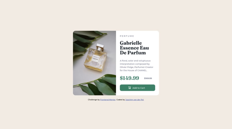
Product preview card component challenge

@JoachimvdP

Desktop design screenshot for the Product preview card component coding challenge

This is a solution for...

  • HTML
  • CSS
1newbie
View challenge

Design comparison


SolutionDesign

Solution retrospective


Challenge number 3 done!

In this challenge my goal was to use flexbox to create a responsive layout. However, I found that it made more sense to use media queries, because the cut-off point between the desktop and mobile layout was difficult to pinpoint. I am happy with how my solution turned out, but I do wish I could've written the css more concisely. I also wonder if it would be possible to create the layout using just flexbox (or grid), without media queries.

The most difficult part for me was getting the image right. I was struggling becauce I kept having it overflow and cause unexpected side-effects (I tried using flex-wrap with disastrous consequence). The switch between desktop and mobile images was something I was wholly unaware of even being possible, so that turned out to be a good learning moment.

Community feedback

Jack 150

@Damuzid

Posted

Hi Joachim,

Take a look at this codepen I made. I made a simple 2 column layout with flexbox that is responsive without the use of a media query. If you use flex-basis with a min-width you can get the desired cut-off point.

For the image you could use the picture tag in your HTML to change the image at a certain resolution, for example:

<picture>
  <source srcset="image-product-mobile.jpg" media="(max-width: 600px)" />
  <img class="product-image" src="image-product-desktop.jpg" alt="parfume-product" />
</picture>

Some other things I saw in your code:

  • I see you used a h3 heading before a h2 heading and no h1 heading. Use a h1 (only one per page) when you are using headings and always use them in order. Headings are used to index your page and by screen reading software to navigate the page.

  • Put your "main" code in your HTML file (in this case the card) between the <main></main> tag and the attribution between the <footer></footer> this will solve your accessibility report error's.

  • Always use the alt attribute when using images, again for better accessibility of your page.

  • You should also use em/rem for your font sizes besides the padding and margins.

Something that might be interesting is using a full css "reset" (I see your already doing a bit of resetting with box-sizing). Take a look at this reset from Josh Comeau which does alot with just a few lines to get a clean start with every project.

Happy coding! en succes met de volgende challenge.

Marked as helpful

0

@JoachimvdP

Posted

@Damuzid

Hey Jack, thanks for the great feedback! I played around with your Codepen a little bit and it's really nice learning more about the different ways in which flexbox can be used.

Writing accessible HTML code is something I want to learn more about, so I really appreciate your feedback here. I remember reading about accessibility on web.dev, but as I had very little experience with even basic HTML at the time of reading it was quite overwhelming. Perhaps it is time to take a look at it again!

0

Please log in to post a comment

Log in with GitHub
Discord logo

Join our Discord community

Join thousands of Frontend Mentor community members taking the challenges, sharing resources, helping each other, and chatting about all things front-end!

Join our Discord