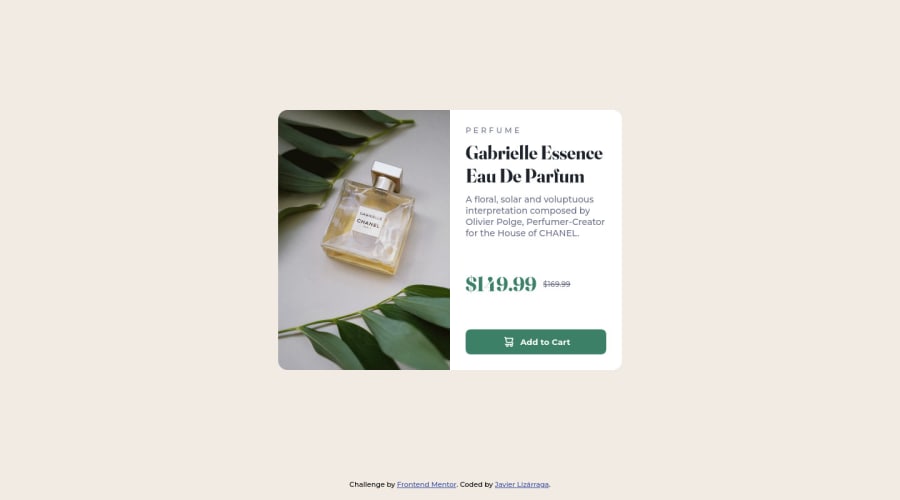
Design comparison
Solution retrospective
Trying to make it responsive. The image size seems to be the one that dictates the height. How do I use less code.
Community feedback
- @correlucasPosted over 2 years ago
👾Hello Javaled, congratulations for your new solution!
I've one tip for you about the overflow you've used in the container and some issues you can have due this property.:
You've used the property
overflow: hidden;but this is making the text content being cropped(see what happens in 230px). I know that you've used it to have the image with the borders rounded (in this case is better you add border-radius to the image instead).main-container-card { width: 550px; display: grid; grid-template-columns: repeat(2, 1fr); border-radius: 15px; /* overflow: hidden; */ }👋 I hope this helps you and happy coding!
Marked as helpful1 - @DavidMorgadePosted over 2 years ago
Hey Javaled! congrats on finishing the challenge.
In this case try to keep your mobile size of the mediaquery until at least 768px, wich is the device size for tablets, I think the mobile layout fits better from 0 to 768px than 0 to 420px, it will target more mobile devices if you extend it to 768!
Also for the html, you can have your card on the
main, and then define thesectionsas each side part of the card, instead of having main > section > divs as the structure you could go as this:<main> <section> /*your picture goes here*/ </section> <section> /*your text goes here, use any necessary divs, for example for the prize and prize modifiers*/ </section> </main>Hope my feedback helps you in future projects!
Marked as helpful1
Please log in to post a comment
Log in with GitHubJoin our Discord community
Join thousands of Frontend Mentor community members taking the challenges, sharing resources, helping each other, and chatting about all things front-end!
Join our Discord
