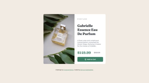
Product preview card component built with HTML and CSS
Design comparison
Solution retrospective
I found this challenge much easier then the one before and I'am happy for that also I have no idea about the responsive version I'm going to learn it then make an update on github waiting for your feedback
Community feedback
- @justinconnellPosted 9 months ago
Good work submitting your solution!
I reviewed the preview site and the desktop layout looks great. The mobile layout has not been implemented.
I looked at the code and it seems that you have a media query to wire up the layout change at
375px
- I suggest you use a higher breakpoint for the mobile view and also that you try following a 'mobile first' approach to implementing the design.Another thing you can do to simplify your code is to use the
picture
HTML5 element or usesrcset
on a singleimg
to handle multiple images.I hope you find this helpful...
Carry on coding!
Marked as helpful1@ZahrouniSPosted 9 months ago@justinconnell Thank you for your feedback I made some adjustment to the Css adding media querry if u had time check it out and give me feedback THANKS ALOT!
0@justinconnellPosted 9 months agoHey @ZahrouniS,
Looked at the preview site and it's way better well done!
If you look at the top side of the card, the rounding needs to be adjusted at the break for smaller screens.
Also look at the paragraph - that needs some padding/margin on the right.
Otherwise way better!
Last thing - please format the CSS code - you can use your editor to format the document - this will make it more readable.
Hope that helps
Carry on coding1
Marked as helpful0
Please log in to post a comment
Log in with GitHubJoin our Discord community
Join thousands of Frontend Mentor community members taking the challenges, sharing resources, helping each other, and chatting about all things front-end!
Join our Discord