Not Found
Not Found
Not Found
Not Found
Not Found
Not Found
Not Found
Not Found
Not Found
Not Found
Not Found
Not Found
Not Found
Not Found
Not Found
Not Found
Not Found
Not Found
Not Found
Not Found

Submitted

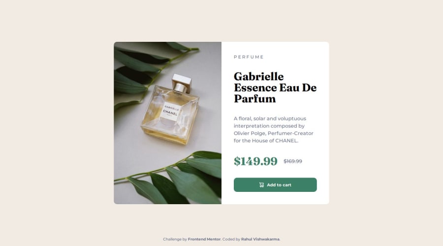
Product Preview Card Component 🎯. ( BEM + Responsive Images )

@rahulkumar215

Desktop design screenshot for the Product preview card component coding challenge

This is a solution for...

  • HTML
  • CSS
1newbie
View challenge

Design comparison


SolutionDesign

Solution retrospective


What are you most proud of, and what would you do differently next time?

Hello, Frontend Mentor community 🙋‍♂️.

This is my solution ✅ for the Product Preview Card Component

I learned about Responsive Images 🖼, picture tag in HTML, It was also a good project to practice Flexbox📦.

It was really easy to make it responsive thanks to flexbox. It really is a powerful tool.

Follow me in my journey to finish all Free 🆓 and Free + challenges (62 left 🎯)! Gotta Catch ’Em All

That's all.

Have Fun Coding!

Community feedback

Daniel 🛸 44,230

@danielmrz-dev

Posted

Hello @rahulkumar215! 🙋🏽‍♂️

Your solution looks excellent!

I have a suggestion that might interest you:

📌 If you don't have the Figma design files, I recommend using a browser extension called Perfect Pixel.

It allows you to compare your finished project with the design images that come along when you download the project and check the (almost exact) dimensions. It's very useful!

I hope it helps you in future projects! 😊

Other than that, great job!

Marked as helpful

0

@rahulkumar215

Posted

Hello @danielmrz-dev,

I was wondering the same thing about how can I get the solution to look exactly like the design.

Thank you so much!

1

@Alil0l

Posted

This is such great work!

I loved the picture in the README file I'd love to try it too.

I wanted to ask, why you used before and after for * element 🤔

I'm still new and would love to learn more 😁

0

@rahulkumar215

Posted

Hello @Alil0l ,

Thanks for checking out my solution.

The reason to use ::before and ::after for * element is that when you define a ::before and ::after element or pseudo classes, then it help with their positioning with setting their margin and padding to 0, and box-sizing to border-box.

Overall it is a best practice in CSS to do so.

Commonly you will see,

*{ margin: 0; padding: 0; box-sizing: border-box; }

from the start the browser applies some default margins and padding to HTML elements, We use this base style to reset that style.

Check out more here :-

-Why do we set the base style?

-What is box-sizing?

That is everything, If you have more questions, feel free to ask. I will be more than happy to help 😃

Have Fun Coding!

1

Please log in to post a comment

Log in with GitHub
Discord logo

Join our Discord community

Join thousands of Frontend Mentor community members taking the challenges, sharing resources, helping each other, and chatting about all things front-end!

Join our Discord