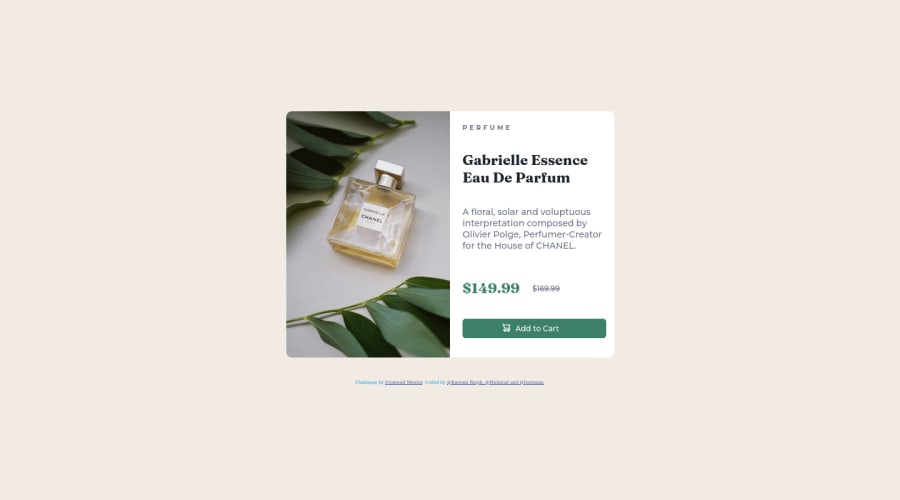
Design comparison
Solution retrospective
Hei, Challenge was done in collaboration by @Mahmud, @Kareem Roqib and @Darionas on GitHub. Main purpose was to practise on Git and GitHub. Any feedback is appreciated. Created with love.
Community feedback
- @Jeen-PreshPosted almost 2 years ago
Hello Darionas, congratulations on completing the fem challenge and also on collaborating with others. very impressive.
Some few suggestions to help improve your project
- Your code below is meant to be wrapped with an
h1
tag.
<h3 class="product-type">PERFUME</h3>
-
The product description should be wrapped with a
p
tag, you can replace thediv
element with ap
tag and leave the class in thep
tag. -
For the old price, you should add a
span
tag with a class ofsr-only
inside your del element and a text that says the old price, and use CSS to make it hidden. this ensures it's being read out for screen-readers.
for more info on
sr-only
class. sr-only KittyGiraudel\- for mobile screens, it isn't centered properly.
Happy coding. if you found this helpful, make sure to mark as helpful thanks.
Marked as helpful0@DarionasPosted almost 2 years ago@Jeen-Presh, Thank you for fast response. I am going to implement your recommendations. I very appreciate it. Thanks again.
It has implemented already.
0 - Your code below is meant to be wrapped with an
Please log in to post a comment
Log in with GitHubJoin our Discord community
Join thousands of Frontend Mentor community members taking the challenges, sharing resources, helping each other, and chatting about all things front-end!
Join our Discord