Not Found
Not Found
Not Found
Not Found
Not Found
Not Found
Not Found
Not Found
Not Found
Not Found
Not Found
Not Found
Not Found
Not Found
Not Found
Not Found
Not Found
Not Found
Not Found
Not Found

Submitted

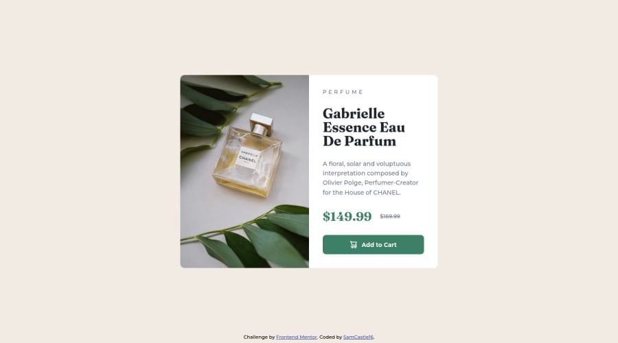
Product preview card component

@SamCastle16

Desktop design screenshot for the Product preview card component coding challenge

This is a solution for...

  • HTML
  • CSS
1newbie
View challenge

Design comparison


SolutionDesign

Solution retrospective


Hello everyone!

I hope you will tell me what you think about my development of this mini-project and what things could be changed and improved. It would be greatly appreciated!

Community feedback

@godsonCodes

Posted

Hello @SamCastle16.

Great work on this project.

The transition on the button really got me like wow!!

I however think you could reconsider the margins between elements on the mobile view of the site. They seem a bit too far apart.

Great work once again. Thanks for sharing.

Marked as helpful

1

@SamCastle16

Posted

@godsonCodes Hi mate!

YES! The transition on the button adds a plus to the design, it's very cool😍.

I have already fixed the responsive, it had problems with the height of the main container, I hope you see it again.

Thanks for your feedback✌!

1

@VCarames

Posted

Hey @SamCastle16, some suggestions to improve you code:

  • For this challenge you want to use the Picture Element not the Background Image Property. The Background Image Property is mainly used on decorative images

Picture Element will allow your to switch between images in different breakpoints and makes your site load faster by saving bandwidth.

Here is an example of how it works: EXAMPLE

Syntax:

  <picture>
    <source media="(min-width: )" srcset="">
    <img src="" alt="">
  </picture>

More Info:

https://www.w3schools.com/html/html_images_picture.asp

https://web.dev/learn/design/picture-element/

  • Once you fix the image implementation, you'll want to include an Alt text tag with them. Inside that Alt Tag you want to describe what the image is; they need to be readable. Assume you’re describing the image/icon to someone.

  • There is only one heading in this challenge and that is the name of the perfume, “Gabrielle Essence Eau De Parfum”.

  • The old price 🏷 is not being announced properly to screen readers. You want to wrap it in a Del Element and include a sr-only text explaining that this is the old price.

Happy Coding! 👻🎃

0

Please log in to post a comment

Log in with GitHub
Discord logo

Join our Discord community

Join thousands of Frontend Mentor community members taking the challenges, sharing resources, helping each other, and chatting about all things front-end!

Join our Discord