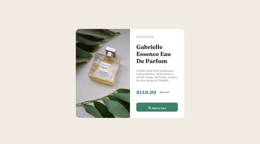
Design comparison
SolutionDesign
Community feedback
- @Shivraj-K09Posted over 1 year ago
Your
HTMLandCSScode look correct, and theproduct preview card componentlooks good. However, here are some suggestions that you could consider -- Use
semantic HTML elementslikeheader,main,navandfooterto improve the readability and accessibility of your code. You might want to consider reducing thefont sizeof your content on smaller screens. Afont sizeof14pxon smaller screens may result in poor legibility. - You may also want to consider adding a
media queryto adjust thedimensionsandlayoutof the section element based on the device screen size to enhance user experience. - Otherwise, your code looks good and is well-organized. Happy Coding 😉
Marked as helpful0 - Use
- @HassiaiPosted over 1 year ago
For a responsive content in the media query replace the width in the section with max-width.
Use relative units like rem or em as unit for the padding, margin, width values and preferably rem for the font-size values, instead of using px which is an absolute unit. For more on CSS units Click here and here
Hope am helpful.
Well done for completing this challenge. HAPPY CODING
Marked as helpful0
Please log in to post a comment
Log in with GitHubJoin our Discord community
Join thousands of Frontend Mentor community members taking the challenges, sharing resources, helping each other, and chatting about all things front-end!
Join our Discord
