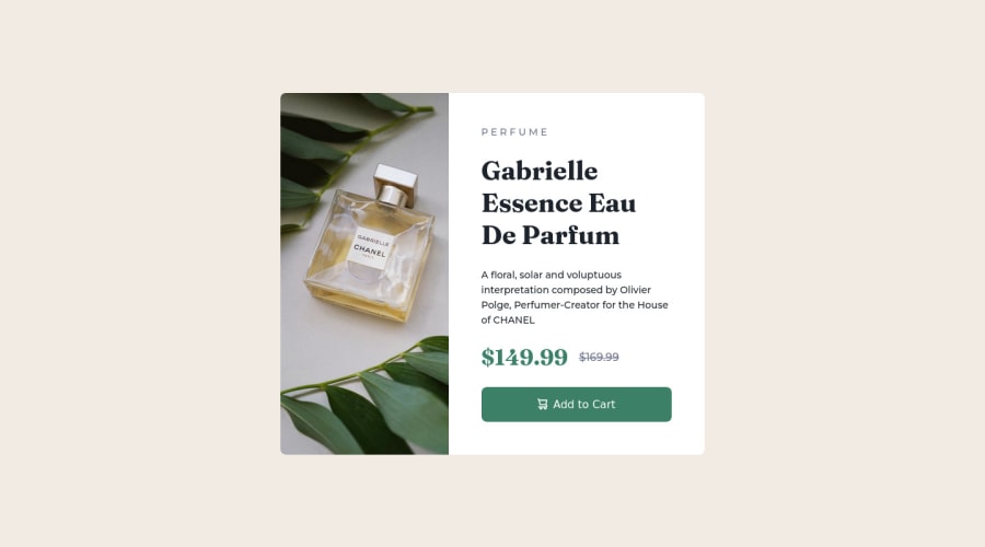
Design comparison
SolutionDesign
Solution retrospective
The area of the code I'm too unsure of is the outcome of the size of the side image. I feel it looks shrank and not equal to what I see in the design.
Community feedback
- @sulemaan7070Posted almost 2 years ago
hey Victor Bruce😄, congratulations on completing the challenge I have inspected your site and regarding your question
why your image shrank?.- You have used the image as a background and you have used the property
background-size:coverinstead you can usebackground-size:containwhich will prevent your problem, and you can do the same for both images. - You have also given the image a width of
width:50vwyou can usewidth:100%and shrink the whole container based on the image size. - along with that give
border-radiusto give the shape to the image edges. - also you can give
cursor:pointerto the button. let me know if you need further help💯💯 happy coding🔥🔥
Marked as helpful0 - You have used the image as a background and you have used the property
Please log in to post a comment
Log in with GitHubJoin our Discord community
Join thousands of Frontend Mentor community members taking the challenges, sharing resources, helping each other, and chatting about all things front-end!
Join our Discord
