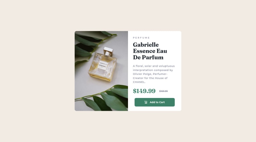
Design comparison
Community feedback
- @VCaramesPosted almost 2 years ago
Hey there! 👋 Here are some suggestions to help improve your code:
- The image’s
alt tagdescription needs to be improved upon to better describe what it is. You will want to assume that you are describing the image to a someone.
More Info:📚
https://www.w3.org/WAI/tutorials/images/
- This component requires the use of two images 🎑 at different breakpoints. The
pictureelement will facilitate this.
Here is an example of how it works: EXAMPLE
Syntax:
  <picture>
    <source media="(min-width: )" srcset="">
    <img src="" alt="">
  </picture>
More Info:📚
https://www.w3schools.com/html/html_images_picture.asp
- The only heading in this component, is the name of the perfume; “Gabrielle Essence Eau De Parfum” . The rest of the text should be wrapped in a
paragraphelement.
- Currently, the old price (169.99) 🏷 is not being properly announced to screen readers. To fix this, you are going to wrap the the price in a
delelement and inside it you will add aspanelement with ansr-only classthat will state something like “The previous price was…” and use CSS to make it only visible to screen readers.
More Info:📚
- Your "button" was created with the incorrect element. It should be created using the
buttonelement. So that when the user clicks on the button (with the help of JS) it should add the product to the cart.
More Info:📚
- The "shopping cart" icon 🛒 is decorative, so its Alt Tag should left blank and have an aria-hidden=“true” to hides it from assistive technology.
If you have any questions or need further clarification, feel free to reach out to me.
Happy Coding!🎄🎁
Marked as helpful0@Gerardofl84Posted almost 2 years ago@vcarames I really appreciate the advice to improve my code, thank you very much.
0@VCaramesPosted almost 2 years ago@Gerardofl84
I am glad that I was able to help out!
Keep it up!
0 - The image’s
- @catherineisonlinePosted almost 2 years ago
Looks nice. After around 638px and before 501px screen width the container is too close long and doesn't have enough space around it, might want to fix that 😊
Marked as helpful0@Gerardofl84Posted almost 2 years ago@catherineisonline I fixed the margin, thanks for the observation
0 - @Nadine-GreenPosted almost 2 years ago
HEY GERARDO!
I AM VERY IMPRESSED
Your solution is an exact replica of the design, however, I noticed that the screenshot generated does not match that of the website, a fix to this would be to generate a new screenshot, the button to do so should be located just above the screenshot itself.
IF YOU FOUND THIS IN ANYWAY USEFUL, DON'T HESITATE TO MARK IT AS USEFUL :)
HAPPY CODING!
Marked as helpful0@Gerardofl84Posted almost 2 years ago@Nadine-Green I took a second screenshot, thanks for the hint
0 - @NikolaD93Posted almost 2 years ago
The design look great bro! However you didn't apply any link to src tag in the image for product.
Marked as helpful0@Gerardofl84Posted almost 2 years ago@Nikola1232456 fix the src, change it to a div
1
Please log in to post a comment
Log in with GitHubJoin our Discord community
Join thousands of Frontend Mentor community members taking the challenges, sharing resources, helping each other, and chatting about all things front-end!
Join our Discord
