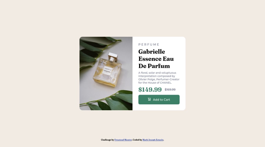
Design comparison
SolutionDesign
Community feedback
- @VCaramesPosted almost 2 years ago
Hey there! 👋 Here are some suggestions to help improve your code:
- Since the images in this component add value and serve a purpose (displaying the product) it needs to be accessible ⚠️. The image needs to be applied using the
pictureelement and not thebackground-imageproperty, as it will not only let you use different images during different breakpoints it will let apply analt tagdescription to image stating what the image is.
- Do not uppercase ❌ "perfume" in HTML as it is not accessible friendly. Instead you will want to style it in CSS.
- Currently, the old price (169.99) 🏷 is not being properly announced 😢 to screen readers. To fix this, you are going to wrap the the price in a
delelement and inside it you will add aspanelement with ansr-only classthat will state something like “The previous price was…” and use CSS to make it only visible to screen readers.
More Info:📚
- Your
CSS Resetis being underutilized. 😢 To fully maximize 💯 it, you will want to add more to it.
Here are some examples that you can freely use:
- Implement a "Mobile First" approach 📱 > 🖥
Mobile devices are now the dominant 👑 way in which people browse the web, it is critical that your website/content looks perfect on all mobile devices.
More Info: 📚
If you have any questions or need further clarification, feel free to reach out to me.
Happy Coding! 🎆🎊🪅
0 - Since the images in this component add value and serve a purpose (displaying the product) it needs to be accessible ⚠️. The image needs to be applied using the
Please log in to post a comment
Log in with GitHubJoin our Discord community
Join thousands of Frontend Mentor community members taking the challenges, sharing resources, helping each other, and chatting about all things front-end!
Join our Discord
