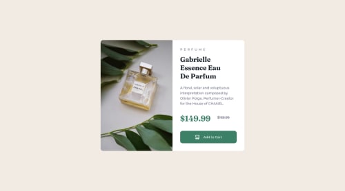
Not Found
Not Found
Not Found
Not Found
Not Found
Not Found
Not Found
Not Found
Not Found
Not Found
Not Found
Not Found
Not Found
Not Found
Not Found
Not Found
Not Found
Not Found
Not Found
Not Found

Submitted

Product Preview Card

Samira 50

@SamiraAliGaal

Desktop design screenshot for the Product preview card component coding challenge

This is a solution for...

  • HTML
  • CSS
1newbie
View challenge

Design comparison


SolutionDesign

Solution retrospective


So I've tried my best, but the cart icon is off, it happened when I tried sizing it down, that it got cut off. Anyway this is my best result, tried to stay as close to the design as possible.

Community feedback

Eren 210

@for-dev9

Posted

Hi, Nice job. You can change your CSS class when screen size change by using @media

Example // effect when screen size is <= 600px and then change flex-direction from row to column

@media (max-width: 600px) {
  .yourClass {
    flex-direction: column;
  }
}

For more information https://www.w3schools.com/cssref/css3_pr_mediaquery.php

Marked as helpful

1

@kldupless

Posted

When you have an icon inline with text like that, you can either set a specific class for the image or use a child combinator to make the icon the same height as the text.

E.g, this will target every image that's a child of a button element and make it the same height as the text:

button > img {height: 1em}

Or you can put the property on the image via a class: .button-icon {height: 1em}

Marked as helpful

0

Please log in to post a comment

Log in with GitHub
Discord logo

Join our Discord community

Join thousands of Frontend Mentor community members taking the challenges, sharing resources, helping each other, and chatting about all things front-end!

Join our Discord