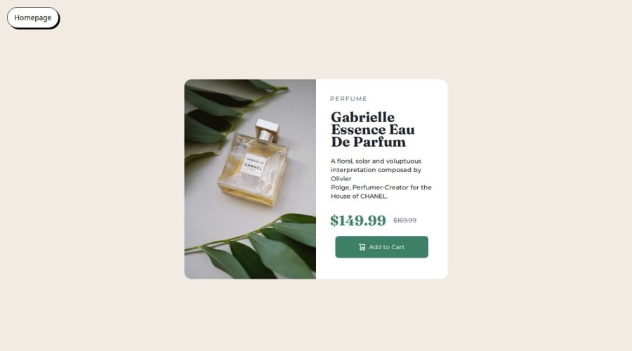
Design comparison
Solution retrospective
Im proud of getting the layout pretty quickly especially for the mobile design. I also did mobile first which is something I am not comfortable with so I want to get better at it. Next time I will try to get the responsiveness done quicker
What challenges did you encounter, and how did you overcome them?I was having some trouble getting it into desktop view after I was finished with the mobile view. I went to chat gpt and google to figure out what I was doing wrong.
What specific areas of your project would you like help with?any tips for the responsiveness would help. It seems like it takes me a long time to figure out the responsiveness. Also I always struggle with sizes. min and max width and heights screw me up and i have things that keep growing and things that stay a certain size which is frustrating. I have to toy around with the sizes which takes me a little long, i wish I could get that down in 1 try.
Community feedback
Please log in to post a comment
Log in with GitHubJoin our Discord community
Join thousands of Frontend Mentor community members taking the challenges, sharing resources, helping each other, and chatting about all things front-end!
Join our Discord
