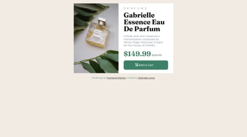
Product preview card component

Solution retrospective
I am most proud of the responsiveness because I used the mobile first approach. This approach reduced the line of codes I have in my css media query.
What challenges did you encounter, and how did you overcome them?Changing the image based on the screen size was one of the challenge I faced. But, I over came by searching on the internet and finding the right css property to achieve what I was after
What specific areas of your project would you like help with?The cart icon in the add to cart button isn't fixed on tablet to desktop but it is on mobile screen. Here's the CSS for tablet/desktop .cart { position: absolute; right: 44%; margin-top: 30px; } On mobile its in the right position but on tablet/desktop screen size it gives space between the icon and "add to cart" text. How do I fix this issue?
Please log in to post a comment
Log in with GitHubCommunity feedback
No feedback yet. Be the first to give feedback on OL's solution.
Join our Discord community
Join thousands of Frontend Mentor community members taking the challenges, sharing resources, helping each other, and chatting about all things front-end!
Join our Discord