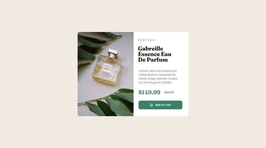
Design comparison
Solution retrospective
Hi! I'll be glad for your opinions and tips about my code :D
Community feedback
- @rockdoginafogPosted almost 2 years ago
It's really nice if u understand positioning at this point, but there's no need in using position absolute and relative everywhere.
Try doing this challenge once again and build it using flexbox., use positioning as less as you can because it's not very responsive.
U can do the same thing without manually positioning everything.
Your flexbox doesn't work, because it's applied to body element so whole body element is displayed as column, and it changes nothing. This should be applied to card element.
Happy coding man, try this challenge once again! :D
polska gurom
Marked as helpful1@ClaudioAmarenoPosted almost 2 years ago@rockdoginafog Thanks man, btw is everything alright with my HTML code?
polska guuurom
0@rockdoginafogPosted almost 2 years ago@ClaudioAmareno
card__main-text
and inside:
card__text
You have something like this.
Instead of card__text I would use something like card__description or something else, anyway I see you are using BEM so it's alright if u make more project it will be easier for you to use it better, it's not that important now, but keep good habits.
1@ClaudioAmarenoPosted almost 2 years ago@rockdoginafog I hope that, now is much better
0
Please log in to post a comment
Log in with GitHubJoin our Discord community
Join thousands of Frontend Mentor community members taking the challenges, sharing resources, helping each other, and chatting about all things front-end!
Join our Discord
