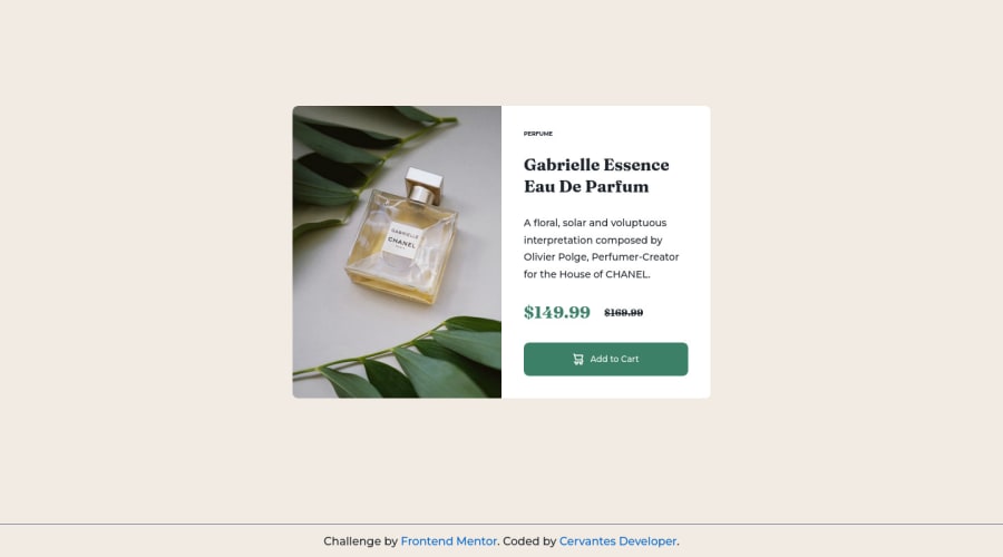
Design comparison
Community feedback
- @TayAki79Posted about 2 years ago
Hi, congrats on finishing this challenge. I like your code. I just finished it as well and I have to say that I really had a hard time with the @media query by targeting the desktop-img of the srcset. How was it for you?
Keep the good work! =)
1@cervantesdeveloperPosted about 2 years ago@TayAki79 Hi, thanks for your comments, I have just watch your solution, I like it pretty much, specilly because the text is really similar to the originall desing. About the images, I watched your code, and I have to recognize that I didin't kwow that style of markup. I usually use the tag <picture>
'<picture> <source srcset="images/image-product-desktop.jpg" media="(min-width: 768px)">
<img src="images/image-product-mobile.jpg" alt="perfume Gabrielle Essence"></picture>'
1 - @TayAki79Posted about 2 years ago
Hi Victor,
thanks man. Haha, in fact I googled it like to today the first time how to use different images respectively different image sizes so you can automatically change them whenever you change the width of your project using @media queries. Then I found so many different ways of using the srcset attribute. But whatever man, as long we have the same solution I guess for now it's all good. We still have time to dive deeper into this rabbit coding hole. Peace!
^^
0@cervantesdeveloperPosted about 2 years ago@TayAki79 You are right, there are many ways ito find the solution. Regards
0
Please log in to post a comment
Log in with GitHubJoin our Discord community
Join thousands of Frontend Mentor community members taking the challenges, sharing resources, helping each other, and chatting about all things front-end!
Join our Discord
