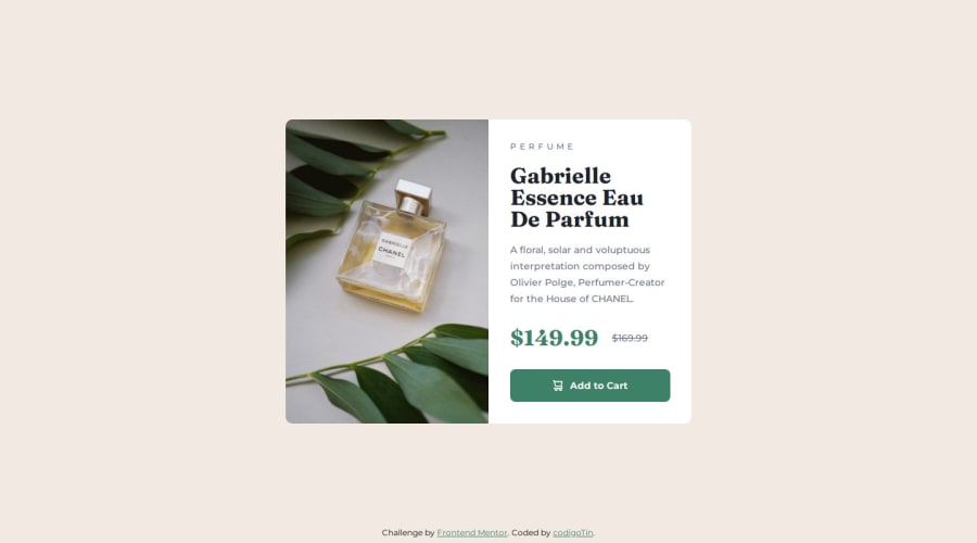
Not Found
Not Found
Not Found
Not Found
Not Found
Not Found
Not Found
Not Found
Not Found
Not Found
Not Found
Not Found
Not Found
Not Found
Not Found
Not Found
Not Found
Not Found
Not Found
Not Found

Submitted

Product preview card component

P
codigoTin 100

@codigotin

Desktop design screenshot for the Product preview card component coding challenge

This is a solution for...

  • HTML
  • CSS
1newbie
View challenge

Design comparison


SolutionDesign

Solution retrospective


What challenges did you encounter, and how did you overcome them?

The image in pc and mobile version is different, instead of placing the image directly I used it as background.

What specific areas of your project would you like help with?

The detail, I always want to improve the layout pixel by pixel.

Community feedback

haquanq ®️ 1,585

@haquanq

Posted

Hello @codigotin,

Nice work, when i preview you solution live it looks good and similar to the given design.

About HTML

  • Avoid using div whenever possible (div has no semantic meaning - choose div when there is no other element or for styling purpose). Consider using more semantic element such as section, article,.. to wrap the content (depend on the content - is it a section or article?).
  • Page must have one h1 to give the page a title (in your case you can switch h2 to h1). Remember to never skip heading level (like h2 to h4 or like you just have an h2).
  • Use img for the product image since this is an meaningful image of the product (use background-image for decoration images/patterns) and provide a descriptive alt attribute.
  • There is no need to wrap .title and .description inside div (as i said above, div provide no semantic). Leave the elements as it is since they do not need any special layout control (like flexbox) and they stay the same vertically to the left.

About CSS

  • Never use fixed width, height on element (unless it really need it), this make your element less responsive, work around min/max-height, min/max-width instead.
  • Because you are using fixed width, height it makes the layout shift in media queries too rushed (check out my solution)
  • Consider practice using BEM for naming classes.

About improve the details, you need to create reusable component (classes) such as typo styles (from Figma) and work from it to spacings between elements.

That is for now, have a nice day and happy coding !!!

0

Please log in to post a comment

Log in with GitHub
Discord logo

Join our Discord community

Join thousands of Frontend Mentor community members taking the challenges, sharing resources, helping each other, and chatting about all things front-end!

Join our Discord