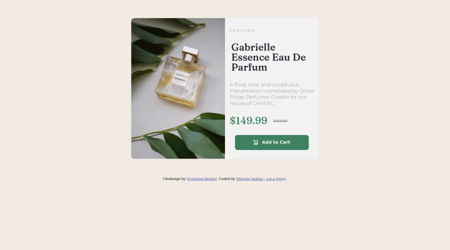


Design comparison

Solution retrospective
Hi! I had a problem and I didn't understand what was causing the error in the <button> (HTML lines: 52 to 55; CSS lines: 94 to 115) that was cut in half at the end of the card in mobile mode. Also, any wrong syntax or that could be done differently but still simple that you can point out will be of great help to recognize where I can still improve.
Community feedback
- @fmanimashaunPosted almost 2 years ago
Hi @@Vvnyy,
Great attempt! I noticed you were using fixed height in your code: for example, in lines 29, 38, 97, 122 and 131 in your CSS file. Kindly remove all fixed heights. If you set the right font size, padding and margin of all elements, you will get the right height without specifying them directly. The best practice is to let the content of your box or container determine its height and width, except when you need to set values like max-width/min-width to restrict your content from growing/shrinking out of proportion.
I hope this help! happy coding
2 - @MelvinAguilarPosted almost 2 years ago
Hello there 👋. Good job on completing the challenge !
I have some feedback for you if you want to improve your code.
- ...that was cut in half at the end of the card in mobile mode - r/ Your component is cut off because you are setting a defined height and then removing the excess with "overflow: hidden", setting a defined height makes your component unable to grow or shrink, do not use
heightto define heights of components, or usemin-heightinstead.
Also, your breakpoint (375px) is too small to switch to mobile view.
HTML 📄:
- Use the
<main>tag to wrap all the main content of the page instead of the<div>tag. With this semantic element you can improve the accessibility of your page.
- Use the
<footer>tag to wrap the footer of the page instead of the<div class="attribution">. The<footer>element contains information about the author of the page, the copyright, and other legal information.
-
You could use the
<del>tag to indicate the price that was before the discount. Additionally, you can use asr-onlyclass to describe the discount. This will help screen reader users to understand that the price was discounted.Example:
<del><span class="sr-only">Old price: </span>$169.99</del>
- The product image is not a decoration. You must not use the background-image property to add the product image. Instead, use the
<img>tag to add the image. Use the background-image property only for decorative images that do not add any information to the page.
CSS 🎨:
- Instead of using pixels in font-size, use relative units like
emorrem. The font-size in absolute units like pixels does not scale with the user's browser settings. This can cause accessibility issues for users who have set their browser to use a larger font size. You can read more about this here 📘.
I hope you find it useful! 😄 Above all, the solution you submitted is great!
Happy coding!
1 - ...that was cut in half at the end of the card in mobile mode - r/ Your component is cut off because you are setting a defined height and then removing the excess with "overflow: hidden", setting a defined height makes your component unable to grow or shrink, do not use
- @HassiaiPosted almost 2 years ago
Replace<div class="main-container">with the main tag and <div class="attribution"> with the footer tag to fix the accessibility issues.
there is no need for <b> within the button in the css , give the button a bolder font-weight.
Use relative units like rem or em as unit for the padding, margin, width values and preferably rem for the font-size values, instead of using px which is an absolute unit. For more on CSS units Click here
To center .main-container on the page, add min-height:100vh; display: flex; align-items: center: justify-content: center; or min-height:100vh; display: grid place-items: center to the body.
To center .main-container on the page using flexbox:
body{
min-height: 100vh;
display: flex;
align-items: center;
justify-content: center;
}
To center .main-container on the page using grid: body{ min-height: 100vh; display: grid; place-items: center; }In the media query, there is no need to give .main-container a height value. give .info-container a product-container a width of 100%
Hope am helpful.
Well done for completing this challenge. HAPPY CODING
0


Please log in to post a comment
Log in with GitHub
Join our Discord community
Join thousands of Frontend Mentor community members taking the challenges, sharing resources, helping each other, and chatting about all things front-end!
Join our Discord