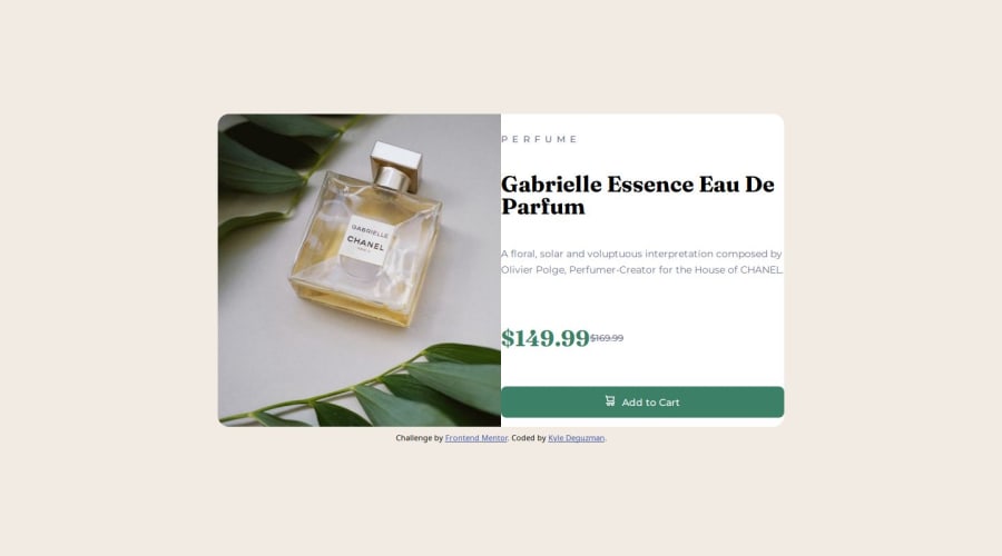


Design comparison

Solution retrospective
I'm happy that I was able to get the design to look good with the mobile first approach.
What I would do differently next time is to set mobile first design to be the default design.
What challenges did you encounter, and how did you overcome them?The hardest part for me was figuring out how to switch between image sizes based on either desktop or mobile design.
I had to reach out to the frontend mentor community for help and also look at others code on how they did it to get an idea how it should be done.
What specific areas of your project would you like help with?In the design, the desktop design still doesn't look accurate.
I'm having trouble with the right side of the card component to resonate with how the final design should look like, I still need some help with that.
Please do look over the code in my repository and the live URL and provide me any feedback with how I can improve this project, thank you.
Community feedback
Please log in to post a comment
Log in with GitHub
Join our Discord community
Join thousands of Frontend Mentor community members taking the challenges, sharing resources, helping each other, and chatting about all things front-end!
Join our Discord