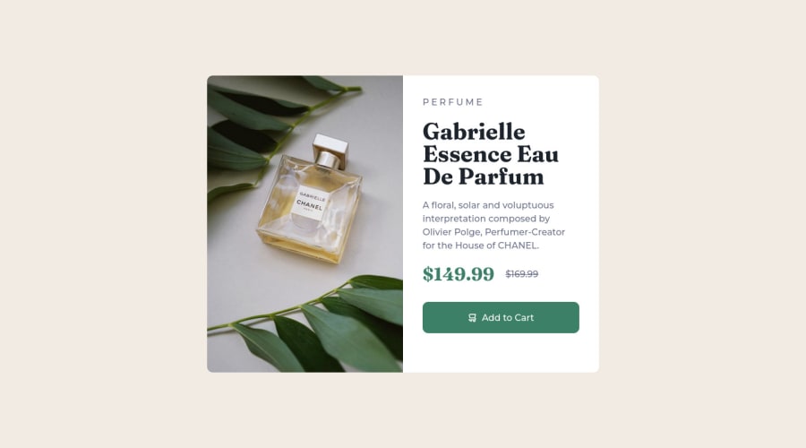
Design comparison
Solution retrospective
Hi guys, I just finished Product preview card component challenge.
One thing I struggled with is how to make the image fit in the div without scratching it. But the only solution I found for that is to make the width and height of the image 100%.
Tell me guys if there is any other way make the image adjust automatically to fit in the div.
Community feedback
- @IkuewumiPosted over 1 year ago
Hi 👋. Cool solution. About your question, I think the aforementioned
pictureelement is the best way. But css could somehow end up squishing the image to fit it in the declared dimensions. To fix this issue, you could check out theobject-fitcss property. You can read more about it on the MDN docs but a basic use would be as follows:selector { .... object-fit: cover; }Anyway, I hope this helps. Feel free to ask any questions, and keep coding 👍,
Ayobami
Marked as helpful0@AghlaAbdoPosted over 1 year ago@Ikuewumi Thank you so much for your feedback, I'll try that
0 - @HassiaiPosted over 1 year ago
Replace <div class="container"> with the main tag to fix the accessibility issue. click here for more on web-accessibility and semantic html
To prevent the content from overflowing on smaller screens, there is no need to give .container a height rather give .left a padding value for all the sides, this will replace the height of .container.
For a responsive content, replace the width in .container with max-width and reduce it value for it to be equivalent to the design.
max-width: 500pxTo center .container on the page using flexbox or grid instead of margin,
- USING FLEXBOX: add min-height:100vh; display: flex; align-items: center: justify-content: center; to the body
body{ min-height: 100vh; display: flex; align-items: center; justify-content: center; }- USING GRID: Add min-height:100vh; display: grid place-items: center to the body
body{
min-height: 100vh;
display: grid;
place-items: center;
}
Use relative units like rem or em as unit for the padding, margin, width values and preferably rem for the font-size values, instead of using px which is an absolute unit. For more on CSS units Click here
You forgot to add a media query for the mobile design. For more on media queries, click here
Hope am helpful.
Well done for completing this challenge. HAPPY CODING
Marked as helpful0@AghlaAbdoPosted over 1 year ago@Hassiai Thank you so much for your feedback
These tips are really helpful for me, I appreciate it.
You're right I totally forgot to make it responsive for mobile lol, I'll do it now 😅
0
Please log in to post a comment
Log in with GitHubJoin our Discord community
Join thousands of Frontend Mentor community members taking the challenges, sharing resources, helping each other, and chatting about all things front-end!
Join our Discord
