Not Found
Not Found
Not Found
Not Found
Not Found
Not Found
Not Found
Not Found
Not Found
Not Found
Not Found
Not Found
Not Found
Not Found
Not Found
Not Found
Not Found
Not Found
Not Found
Not Found

Submitted

Product Preview Card Component

@elfreeze

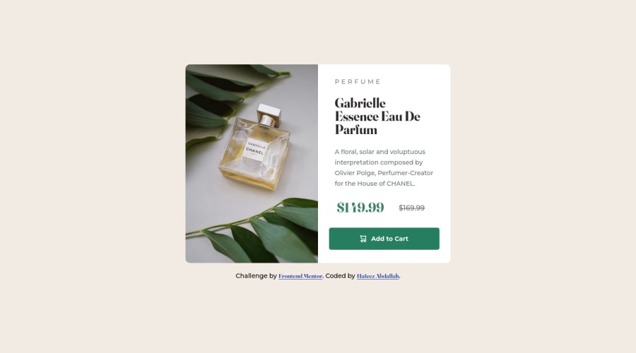
Desktop design screenshot for the Product preview card component coding challenge

This is a solution for...

  • HTML
  • CSS
1newbie
View challenge

Design comparison


SolutionDesign

Solution retrospective


When I started this challenge, I was having difficulty adding border-radius to the image. Initially, I added my image in a div in the HTML code but later realized I could save some code by adding background image in an empty div. I also thought just adding border-radius to the whole preview card div will do the trick for me but I came to realize that I have to add a border-radius to the div containing the background image too.

Community feedback

T
Chamu 13,110

@ChamuMutezva

Posted

Greetings Hafeez . Welcome to Frontend Mentor and congratulations for taking your first challenge.

HTML

  • preferably use semantic html, elements such as header, main , footer gives meaning to your project than the general div element. Semantic elements makes your site accessible without additional coding
  • heading elements should follow a sequential order with the h1 being the first level heading. Use css to style to the correct size.
  • Add to cart , in my opinion should be a button not a link. A link is for navigation purposes while buttons are associated with click events.

CSS

  • try using mobile first for styling, that is your base styles will cater for small devices and then apply media queries when your site start showing of stretching or content is moving out of position. At that point apply media query using min-width
  • for sizes , look at using rems instead of using px values, the following article will guide you on the benefits of that. [rem vs px](Why designers should move from px to rem (and how to do that in Figma))
  • you don't really need to add border-radius to the .img-container , add overflow: hidden; to the .preview-card

Marked as helpful

3

@elfreeze

Posted

Hi Chamu! Thanks for your feedback. I'm really excited to have you review my solution. I've seen your recommendations and I will make corrections ASAP.

Thanks once again.

0

@elfreeze

Posted

@ChamuMutezva Hi Chamu, I made some adjustments to the challenge by implementing some of your suggestions. Thanks for the first review. Can you please help me review it a second time? I'll really appreciate it. Thanks once again.

0
Elaine 11,400

@elaineleung

Posted

Hi Hafeez, welcome to Frontend Mentor, and excellent job on your first challenge! I just saw your preview, and you did a great job getting it to look like the original design in the desktop view. You can now try to fix your mobile view a bit, as it needs some padding, and also the height of the image needs to be resized.

Another thing is, I like how clean and readable your CSS is. One other thing you can try for next time is, you can try to have your CSS in a separate file, as that is a lot more common than having it all on same file as the HTML.

Once again, well done, and keep coding!

Marked as helpful

2

@elfreeze

Posted

Hi Elaine! Thanks for your feedback. I'm really excited to have you review my solution. I've seen your recommendations and I will make corrections ASAP.

Thanks once again.

0

@elfreeze

Posted

@elaineleung Hi Elaine, I made some adjustments to the challenge by implementing some of your suggestions. Thanks for the first review. Can you please help me review it a second time? I'll really appreciate it. Thanks once again.

1
Elaine 11,400

@elaineleung

Posted

@elfreeze Hi Hafeez, no problem at all, love to help out! I just checked out the adjustments; mobile view looks good with the padding added! You might want to change the breakpoint though; when it's at around 480px, there's overflowing that's happening, and so maybe try a higher breakpoint, like something wider than your desktop design, e.g., 660px.

Great job, keep working at it!

Marked as helpful

1

@elfreeze

Posted

@elaineleung Hi Elaine, you've indeed been so helpful by reviewing my work and making suggestions. I really appreciate it. I took my time to make corrections based on your suggestions. My work now looks much like the original. I implemented 3 breakpoints.

You can't imagine how happy I am about the progress and the new stuff I've learned. I will love it if you have another look at my work.

Thanks a lot.

1
Elaine 11,400

@elaineleung

Posted

@elfreeze Looks much better, Hafeez! Glad I could help out in a small way, and you'll find that as you gain more proficiency and knowledge with CSS, you may be able to write your code in a way that does not need as many breakpoints. For now though, just use what works for you, and keep experimenting, even through mistakes. Really proud of you, and keep going!

Marked as helpful

1

Please log in to post a comment

Log in with GitHub
Discord logo

Join our Discord community

Join thousands of Frontend Mentor community members taking the challenges, sharing resources, helping each other, and chatting about all things front-end!

Join our Discord