Not Found
Not Found
Not Found
Not Found
Not Found
Not Found
Not Found
Not Found
Not Found
Not Found
Not Found
Not Found
Not Found
Not Found
Not Found
Not Found
Not Found
Not Found
Not Found
Not Found

Submitted

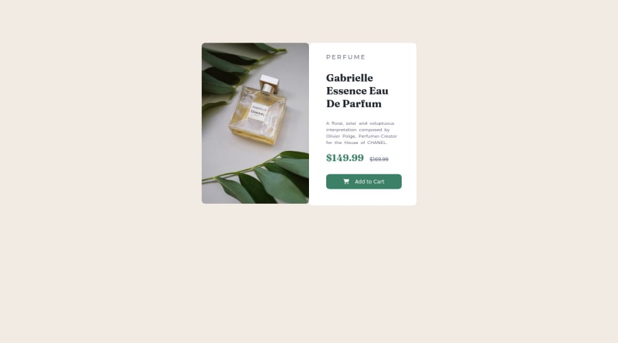
Product Preview Card Component

Desktop design screenshot for the Product preview card component coding challenge

This is a solution for...

  • HTML
  • CSS
1newbie
View challenge

Design comparison


SolutionDesign

Solution retrospective


What things can I improve in my design? Must I develop a mobile version? Do you have any suggestion or tip about best practice? Any advice is welcome. :)

Community feedback

@MelvinAguilar

Posted

Hola @AnthonySSE 👋, ¡Buen trabajo al completar este desafío y bienvenido a la plataforma! 🎉

Aquí hay algunas sugerencias que podría considerar para mejorar su código:

  • Intente usar etiquetas semánticas en su código. En este caso debería tener una etiqueta <main> que agrupe todos sus elementos:
<body>
   <main class="container">
      <div class="panel-izquierdo">
         . . .
      </div>
       <div class="panel-derecho">
         . . .
      </div>
   </main>
<body>
  • Agregue una etiqueta h1 a su solución. El elemento <h1> es el encabezado principal de una página web. Solo debe haber una etiqueta <h1> por página, y siempre evite saltarse los niveles de encabezado; Comience siempre desde <h1>, seguido de <h2>, y así sucesivamente hasta <h6> (<h1>,<h2>,...,<h6>). The HTML Section Heading elements (Reference)

Solución:

<h1>Gabrielle Essence Eau De Parfum</h1>
  • El contenedor no está centrado correctamente. Puede usar flexbox para centrar elementos:
body {
  margin: 0;
  width: 100%;
  min-height: 100vh;
  display: flex;
  flex-direction: column;
  justify-content: center;
  align-items: center;
}

Nota: Eso servirá para centrar su elemento <main> correctamente, su <main> también debería tener displar: flexbox para colocar las dos columnas: "panel-derecho" y "panel-izquierdo"

Referencias (En ingles):

.

  • Para hacer su solución responsiva, debería tener un media query que cambie la dirección de su elemento <main> de "flex-direction: row;" a "flex-direction: column;"
  • Los nombre de clases en ingles es discutible, aunque si es cierto que suelen haber mas personas que saben ingles en estas plataformas.

Espero que esos consejos te ayuden.

¡Buen Trabajo!

Marked as helpful

2

@AnthonySSE

Posted

Hola, @MelvinAguilar. Me he pasado las últimas dos semanas investigando las formas de mejorar en cuanto a desarrollo Front End se refiere. Leí todos los artículos que me comentaste y he seguido practicando. Tus consejos son totalmente apreciados e intentaré aplicar todo lo que me has dicho. ¡Muchas gracias!

1

@DragonFireShield

Posted

Hi Anthony,

First, I suggest to use english class names that convey meaning to any future readers of the code. This way we can see a bit clearer what you are trying to accomplish.

Second, the card doesn't when I change the screen size, so try making it change the image and layout on smaller screen sizes.

Also, I notice that your image and your text both have a separate border-radius. So instead of the image and text part touching corners, they are round. Try giving the whole card a border-radius instead, so that only the card's corners are round.

Hope this helps!

Marked as helpful

1

@AnthonySSE

Posted

Hi, @DragonFireShield. Thanks for the advices. I developed the solution only focus in desktop devices, not for mobile. I'll make some changes to make the solution resposive. I'll try to do my best. :)

0

Please log in to post a comment

Log in with GitHub
Discord logo

Join our Discord community

Join thousands of Frontend Mentor community members taking the challenges, sharing resources, helping each other, and chatting about all things front-end!

Join our Discord