Not Found
Not Found
Not Found
Not Found
Not Found
Not Found
Not Found
Not Found
Not Found
Not Found
Not Found
Not Found
Not Found
Not Found
Not Found
Not Found
Not Found
Not Found
Not Found
Not Found

Submitted

Flexbox solution

@ieatn

Desktop design screenshot for the Product preview card component coding challenge

This is a solution for...

  • HTML
  • CSS
1newbie
View challenge

Design comparison


SolutionDesign

Solution retrospective


Hi you! Thanks for checking out my beginner solution. I rawdogged this with vanilla HTML and CSS flexbox.

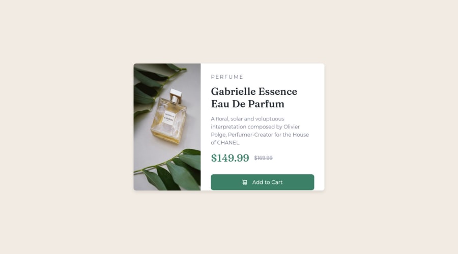
  1. Is my approach to separating the content fine? I used a main container and then used an image for left side and a right div to hold the right side text.
  2. The image was covering up my border so I couldn't get the rounded borders.
  3. How could I refactor the HTML and CSS for cleaner and readable code?
  4. Is there a general guideline for margin, width, height or should you just eyeball it?

Community feedback

@VCarames

Posted

Hey there! 👋 Here are some suggestions to help improve your code:

  1. That’s fine.
  2. To accomplish this apply border-radius along with overflow-hidden to the component’s container.
  3. More detail below.
  4. In a job you’ll have figma files that will give you the correct sizes. For this challenges just try to get as close as possible.
  • To not only improve your HTML code but to also identify the main content of you page, you will want to wrap your entire component inside the main element.

More Info:📚

MDN Main Element

  • The image’s alt tag description needs to be improved upon to better describe what it is. You will want to assume that you are describing the image to a someone.

More Info:📚

https://www.w3.org/WAI/tutorials/images/

  • This component requires the use of two images 🎑 at different breakpoints. The picture element will facilitate this.

Here is an example of how it works: EXAMPLE

Syntax:

  <picture>
    <source media="(min-width: )" srcset="">
    <img src="" alt="">
  </picture>

More Info:📚

https://www.w3schools.com/html/html_images_picture.asp

  • The only heading in this component, is the name of the perfume; “Gabrielle Essence Eau De Parfum” . The rest of the text should be wrapped in a paragraph element.
  • Currently, the old price (169.99) 🏷 is not being properly announced to screen readers. To fix this, you are going to wrap the the price in a del element and inside it you will add a span element with an sr-only class that will state something like “The previous price was…” and use CSS to make it only visible to screen readers.

More Info:📚

Del Element

If you have any questions or need further clarification, feel free to reach out to me.

Happy Coding!🎄🎁

Marked as helpful

1

@catherineisonline

Posted

Nice! 🙌🏻

I would also add some transitions for active states (when colors change on hover). It creates more interactivity and makes the project looks cooler. Active states can be done on buttons, links, titles which act like links or anything else, you choose.

You can read more about it here, in case you haven’t done much of it:
https://www.w3schools.com/css/css3_transitions.asp

IF THIS WAS HELPFUL PLEASE MARK IT AS HELPFUL 🤩

Marked as helpful

0

Please log in to post a comment

Log in with GitHub
Discord logo

Join our Discord community

Join thousands of Frontend Mentor community members taking the challenges, sharing resources, helping each other, and chatting about all things front-end!

Join our Discord