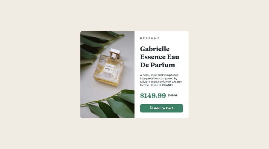
Responsive Product Preview Card


Design comparison

Solution retrospective
I built this project using HTML and CSS.. I'm studying development... Feedback welcome! ^^
Please log in to post a comment
Log in with GitHubCommunity feedback
- @MelvinAguilar
Hello there 👋. Good job on completing the challenge !
I have some suggestions about your code that might interest you.
- It's generally not recommended to use the
overflow: hiddenproperty on the <body> element because it can cause unexpected behavior and make it difficult to access parts of the website
-
Using
height: 100vhfor the body element can cause problems with the layout of the page on smaller screens, such as in landscape view on a mobile device.On smaller screens, such as in landscape view on a mobile device, the height of the viewport may be less than the height of the content of the page. In this case, using height: 100vh for the body element will cause the content of the page to be hidden behind the body element.
Here is an image of how it would look on a mobile device: screencapture-nicoletsingas-github-io-Product-preview-card
To avoid this problem, it is generally recommended to use
min-height: 100vhinstead ofheight: 100vhfor the body element. This will ensure that the content of the page is always visible.
-
You can use the
<picture>tag when you have different versions of the same image 🖼. Using the<picture>tag will help you to load the correct image for the user's device saving bandwidth and improving performance. You can read more about this here 📘.Example:
<picture>
    <source media="(max-width: 460px)" srcset="./images/image-product-mobile.jpg">
    <img src="./images/image-product-desktop.jpg" alt="{your alt text goes here}">
</picture>
- For specificity reasons you should work with classes instead of ids because they are more reusable. You can use ids to work with JavaScript, but you should use classes to style your elements. You can read more about this here 📘.
I hope you find it useful! 😄 Above all, the solution you submitted is great!
Happy coding!
Marked as helpful - It's generally not recommended to use the
- @Hassiai
wrap the old-price in <s><del> for those using screen readers to know of the old price.
<s><del>$169.99</del></s>.To center #product on the page, add min-height:100vh; display: flex; align-items: center: justify-content: center; or min-height:100vh; display: grid place-items: center to the body.
To center #product on the page using flexbox:
body{
min-height: 100vh;
display: flex;
align-items: center;
justify-content: center;
}
To center #product on the page using grid: body{ min-height: 100vh; display: grid; place-items: center; }Use the colors that were given in the styleguide.md found in the zip folder you downloaded.
Use relative units like rem or em as unit for the padding, margin, width values and preferably rem for the font-size values, instead of using px which is an absolute unit. For more on CSS units Click here
Hope am helpful.
Well done for completing this challenge. HAPPY CODING
Marked as helpful - @caiomiyaji
Really good job!


Join our Discord community
Join thousands of Frontend Mentor community members taking the challenges, sharing resources, helping each other, and chatting about all things front-end!
Join our Discord