Design comparison
Solution retrospective
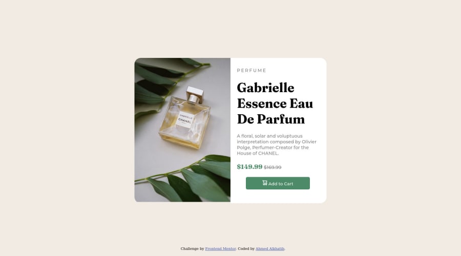
I was unable to make the image div and the information div the same size so there is a slight difference at the bottom where they should be flush. I would appreciate any help in fixing this issue along with any others that are spotted. Any feedback is appreciated, thanks in advance!
Edit: Changes from feedback have been implemented.
Please log in to post a comment
Log in with GitHubCommunity feedback
- @amoorihesham
Great work my friend.
Here's some notes to be know you design looks decent on desktop although in Mobile screen it's unusable. So my advice to get back and tweak the code to make it work in other screen and to read more about media queries. For your question about the image bottom area you can go with set the display of block Or give the image height 100% which will solve that issue too. Keep coding
Marked as helpful - @OpenWorldProjectOWP
@AhmedAlkh Great attempt! Let me share with you what I learned doing this to help you with you improper sizing problem.
Use your <main> as the initial container and set the width to 100%, don't forget to set the justify-content and align-items to "center".
Set up a container div with your image and content inside the <main>.
Utilize the semantics in the HTML to connect the CSS instead of making a class or div for everything. This keeps your code smaller and easier to read.
As for changing the display when the viewport changes, you can use @media in CSS to change the flex-direction to column instead of row for smaller screen sizes.
I used the same advice on a similar project which you can view here: https://github.com/OpenWorldProjectOWP/BetterDev4
Great job and Happy Coding! Hope this helps.
Marked as helpful - @MelvinAguilar
Hi there 👋. Good job on completing the challenge ! I have some feedback for you if you want to improve your code.
By default, images are inline elements. Inline elements generate an invisible space around 3px at the bottom, so your image never touches the container's bottom. It can be removed by using the
display: blockproperty.HTML:
- The
<h1>is the most important heading on the page, In this challenge the perfumer's name can be considered like the title of the page, so it should be the<h1>
- You could use the
<del>tag to indicate the price that was before the discount. Additionally, you can use asr-onlyclass to describe the discount. This will help screen reader users to understand that the price was discounted.
Example:
<del><span class="sr-only">Old price: </span>$169.99</del>- Not all images should have alt text. The cart-icon is a decorative image, it does not add any information to the page. You should use an empty
altattribute instead of a descriptive one. You can read more about this here.
I hope you find it useful! 😄
Happy coding!
Marked as helpful - The
- @Deevyn9
Hi Ahmed, great solution you have here, it looks really great. However, you'll need to change the width for the media query to about 600px so it'll be more responsive.
Happy Coding! 🎉
Join our Discord community
Join thousands of Frontend Mentor community members taking the challenges, sharing resources, helping each other, and chatting about all things front-end!
Join our Discord
