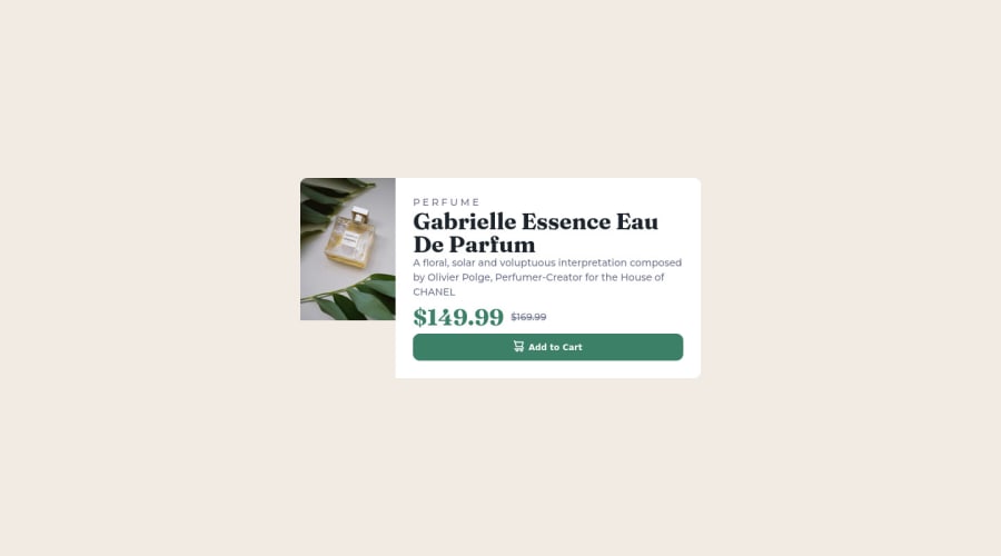
Design comparison
Solution retrospective
i had difficulty on changing images dependent on the width of page i.e desktop and mobile view
Community feedback
- @VCaramesPosted almost 2 years ago
Hey there! 👋 Here are some suggestions to help improve your code:
- It is best practice ✅ to have separate files for you coding files (HTML, CSS, JS). It helps keep things organized and make it easier to maintain.
- The
sectionelement is being used incorrectly ⚠️ and not needed for this challenge .
- The image’s
alt tagdescription needs to be improved upon ⚠️. Assume that you are describing the image to a someone over the phone.
More Info:📚
https://www.w3.org/WAI/tutorials/images/
- This component requires the use of two images 🎑 at different breakpoints ⚠️. The
pictureelement will facilitate this.
Here is how it looks like implemented: EXAMPLE
Syntax:
  <picture>
    <source media="(min-width: )" srcset="">
    <img src="" alt="">
  </picture>
More Info:📚
https://www.w3schools.com/html/html_images_picture.asp
- Do not uppercase ❌ "perfume" in HTML as it is not accessible friendly. Instead you will want to style it in CSS.
If you have any questions or need further clarification, feel free to reach out to me.
Happy Coding! 🎆🎊🪅
Marked as helpful0 - @HassiaiPosted almost 2 years ago
There is no need for a width value, min-width value and max-width value.
Use relative units like rem or em as unit for the padding, margin, width values and preferably rem for the font-size values, instead of using px which is an absolute unit. For more on CSS units Click here
Hope am helpful.
Well done for completing this challenge. HAPPY CODING
Marked as helpful0
Please log in to post a comment
Log in with GitHubJoin our Discord community
Join thousands of Frontend Mentor community members taking the challenges, sharing resources, helping each other, and chatting about all things front-end!
Join our Discord
