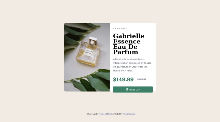
Design comparison
SolutionDesign
Please log in to post a comment
Log in with GitHubCommunity feedback
- @diaasaur
Hey Matej, good job on completing your first challenge!
You can make the button look cleaner by:
- Making the icon and text center aligned(vertical + horizontal) and adding a little more gap between them. Like this:
display: flex; justify-content: center; align-items: center; gap: 0.5em;- Applying the specified font-family and increasing the font size.
Marked as helpful
Join our Discord community
Join thousands of Frontend Mentor community members taking the challenges, sharing resources, helping each other, and chatting about all things front-end!
Join our Discord
