Submitted almost 2 years ago
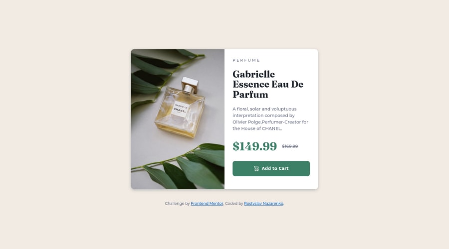
Responsive product card component using HTML, CSS, Flexbox and Grid
@rostyslav-nazarenko
Design comparison
SolutionDesign
Community feedback
- @grace-snowPosted almost 2 years ago
Nice solution, well done!
Just a few issues to address
- the image is huge on mobile because of the height 100%. Move that style to the desktop media query instead
- the image alt needs to be a proper description of what the image looks like. It should not include words like “image” as it’s already an img element
- screenreader users are not informed when a line through style is added. So you need to wrap the old price in a
sordelelement AND add some visually hidden text to let them know that’s the old price
Marked as helpful1@rostyslav-nazarenkoPosted almost 2 years ago@grace-snow Hi, Grace! Thank you so much for the feedback!
- I'm not sure what you mean by that. It didn't affect mobile layout, but it definitely needs to be moved.
- Previously @MelvinAguila provided great article on Alternative Text. But it's still kinda hard for me to decide what description to give to the image, or if it at all needs one, as it doesn't provide any additional information but rather just shows the product. Plus there's the text "Perfume" next to it. So would it be smarter to leave an empty attribute?
- That's a valid point. I need to consider accessibility more during the completion of other challenges.
Thank you, again! Have a great day! 😁
0
Please log in to post a comment
Log in with GitHubJoin our Discord community
Join thousands of Frontend Mentor community members taking the challenges, sharing resources, helping each other, and chatting about all things front-end!
Join our Discord
