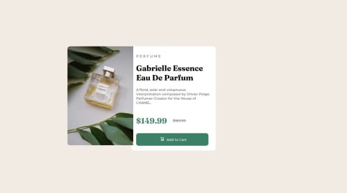
Design comparison
Solution retrospective
how to setup the image on desktop properly as it looks funky
Community feedback
- @danielmrz-devPosted 4 months ago
Hey there! šš½āāļø
Congrats on finishing the challenge! ā
Your project looks awesome!
Here's a tip that might interest you:
š When you have different versions of the same image, consider using the
<picture>
tag.This will help ensure the correct image loads on the user's device, saving bandwidth and boosting performance.
Example:
<picture> <source media="(min-width: 768px)" srcset="{desktop image path here}"> <img src="{mobile image path here}" alt="{alternative text here}"> </picture>
Hope you find this useful!
Great job overall!
0 - @DylandeBruijnPosted 4 months ago
@OriginalMistake
Hiya! š
Congratulations on your solution, it looks very close to the design! I can tell you put a lot of effort into it.
Things you could improve āļø
-
Try experimenting with CSS variables, they help you make your CSS values more reusable across your code.
-
I suggest using clear descriptive CSS classes like
.card
,.card-title
and.card-description
. -
Try using semantic HTML elements like
main
,section
andarticle
. -
Try using using relative CSS units like
rem
andem
they make your layout more adaptable. -
Try looking into the
picture
element to solve your problem. It allows you to provide different images for specific viewports. -
You don't need to use
position: absolute
on your images, you can turn your card in aflex
orgrid
container and position your elements that way.
I hope you find my feedback helpful! š
Let me know if you have more questions and I'll do my best to answer them. šāāļø
Happy coding! š
0 -
Please log in to post a comment
Log in with GitHubJoin our Discord community
Join thousands of Frontend Mentor community members taking the challenges, sharing resources, helping each other, and chatting about all things front-end!
Join our Discord