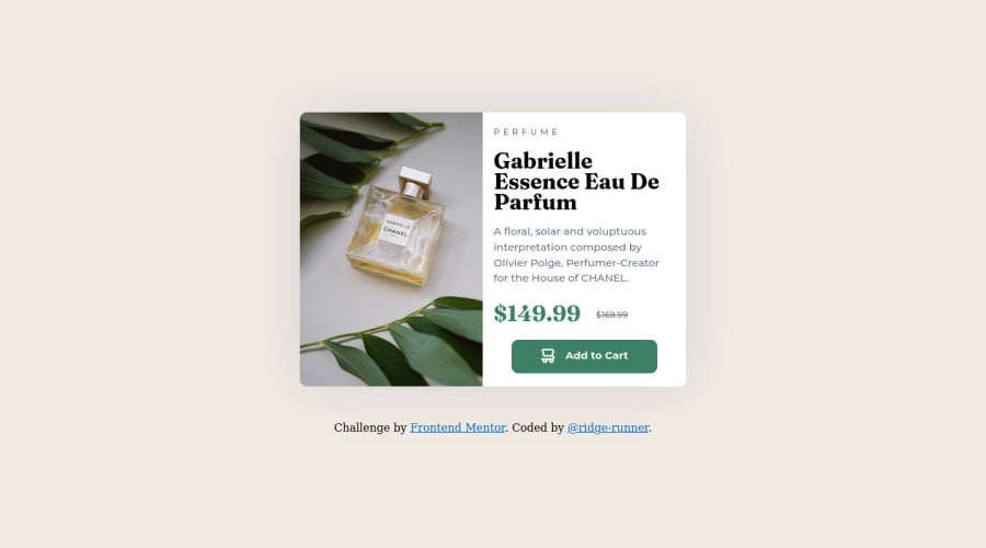
Product Preview Card Component - Mobile First, Cube.css, @media
Design comparison
Solution retrospective
What did you find difficult while building the project?
Still getting positioning and layout down. Learning how margins and padding interact with Flex.
Which areas of your code are you unsure of?
Mostly best practices so that I build good habits early in the learning process. I'm unsure about how I should organize my main style.css sheet. I've tried to create utility classes and custom properties on this project, but still back-slid to doing work on sub-components instead of relying on the utilities to do most of the heavy lifting.
Inheritance still messes with me, but I've started making better use of my browser's dev tools to help with that. I was able to fix an aggravating margin issue using FireFox's CCS inspector tool.
** Do you have any questions about best practices?**
Examples of how to organize my code. As mentioned, I'm learning CUBE.css, but I'm unclear on how to link custom properties and utility classes. I know that the goal is to create a centralized area to make cosmetic changes to a webpage, but I'm still working through the right way to link the two.
I need to work more on accessibility. I'm using semantic HTML, but need to start learning more about ARIA. I was referred to some resources by the community, but just need to spend the time working through it.
** Future work**
Keep adding up the mileage. Ask for help when stuck (something that is really hard for me to do) and not spend valuable hours staring at an problem. Fight with the it before asking for help, but don't let it chew through my practice time. Take notes and implement them on the next project. Thank those who take time to comment.
Community feedback
Please log in to post a comment
Log in with GitHubJoin our Discord community
Join thousands of Frontend Mentor community members taking the challenges, sharing resources, helping each other, and chatting about all things front-end!
Join our Discord
