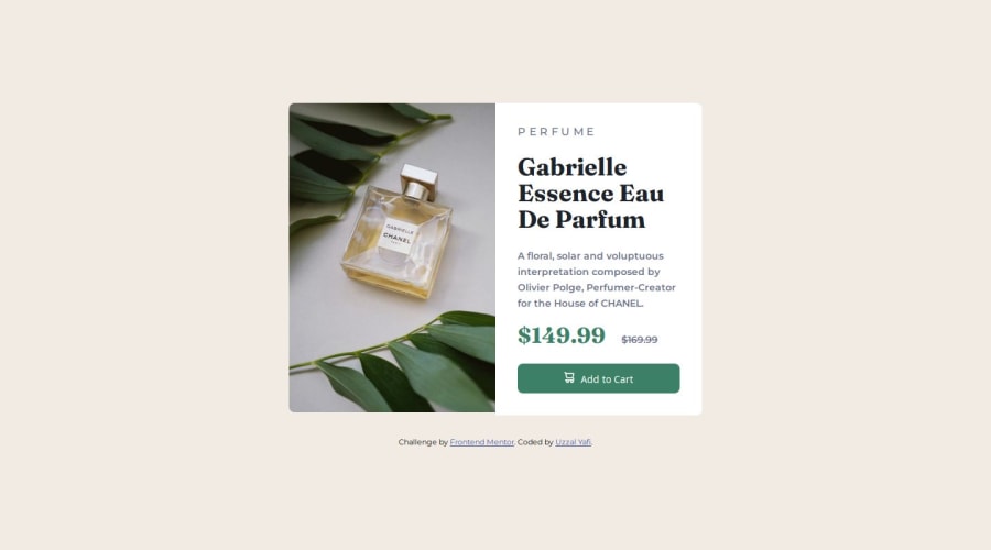
Design comparison
Solution retrospective
What I'm Most Proud Of: I'm particularly proud of the responsive design of the product preview card component. Ensuring it looks polished and functions seamlessly across various screen sizes and devices was a significant achievement for me. Additionally, I take pride in the attention to detail, accurately translating the provided design into a functional HTML/CSS component.
What I Would Do Differently Next Time: Looking back, I see opportunities for improvement in optimizing the codebase further. In future projects, I aim to focus more on code efficiency and performance, including minimizing redundant CSS, optimizing images, and enhancing accessibility. Additionally, I plan to implement better modularization practices, breaking down the CSS into smaller, reusable components for improved maintainability.
What challenges did you encounter, and how did you overcome them?Challenges Encountered: During the development of the product preview card component, I encountered several challenges that tested my problem-solving skills and understanding of HTML and CSS. One challenge was ensuring the responsiveness of the layout while maintaining the design integrity across different viewport sizes. This required careful planning and experimentation with CSS media queries to adjust styles based on screen width.
How I Overcame Them: To address the challenge of responsiveness, I conducted thorough testing on various devices and screen sizes, making iterative adjustments to the CSS until achieving the desired layout flexibility. I also utilized browser developer tools extensively to debug and fine-tune the styles in real-time.
Please log in to post a comment
Log in with GitHubCommunity feedback
- P@danielmrz-dev
Hello @uzzalyafi!
Your project looks great!
I have a suggestion about your code that might interest you:
📌 You can use the
<picture>tag when you have different versions of the same image.Using the
<picture>tag will help load the correct image to the user's device, saving bandwidth and improving performance.Example:
<picture>
    <source media="(min-width: 768px)" srcset="{desktop image path here}">
    <img src="{mobile image path here}" alt="{alternative text here}">
</picture>
I hope this helps!
Other than that, excellent work!
Marked as helpful
Join our Discord community
Join thousands of Frontend Mentor community members taking the challenges, sharing resources, helping each other, and chatting about all things front-end!
Join our Discord
