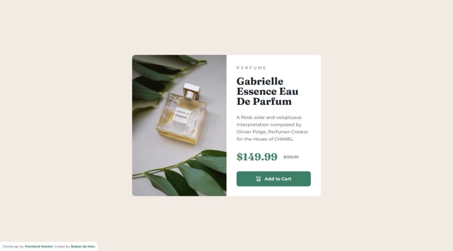


Design comparison

Community feedback
- @Abdulgafar-RiroPosted 2 months ago
Feedback on the Product Preview Card Component Solution
- Semantic HTML Usage
✅ Good Use of Semantic Elements:
The solution correctly uses <main>, <article>, <picture>, <h1>, <p>, <button>, and <footer>, improving readability and accessibility.
<picture> is used effectively to serve different images based on screen size.
🔧 Possible Improvement:
Consider using <section> instead of <div class="card__content"> for better semantic grouping of content.
- Accessibility Considerations
✅ Accessible Features Included:
Alt Text on Images: The product image has an appropriate alt description.
High Contrast Colors: The dark cyan price contrasts well with the background.
Keyboard Navigability: The button uses proper :hover effects and cursor styles.
🔧 Possible Improvements:
The cart icon inside the button has an empty alt attribute (alt=""). While this prevents screen readers from reading an unnecessary description, you could add aria-hidden="true" to explicitly hide it.
Consider adding aria-label="Add Gabrielle Essence Eau De Parfum to cart" to the button to make it more descriptive for screen readers.
- Responsiveness & Layout
✅ Good Mobile Optimization:
The use of CSS Grid (grid-template-columns: 1fr 1fr) ensures a well-structured desktop layout.
The media query (max-width: 600px) properly switches to a single-column layout for mobile users.
The images are responsive, thanks to max-width: 100% in the img styling.
🔧 Possible Improvements:
The mobile card width (max-width: 343px) is quite small. Consider allowing it to stretch slightly for better usability.
The padding (2.4rem) in .card__content may feel a bit tight on smaller screens—try reducing it slightly.
- Code Quality & Readability
✅ Strengths:
Clear, modular CSS structure with variables (:root) for colors and text styles, making it reusable.
Consistent use of BEM naming conventions (card__content, card__price--new), improving maintainability.
Logical CSS resets (e.g., box-sizing: border-box; margin: 0; padding: 0;).
🔧 Possible Improvements:
The custom fonts should have font-display: swap; to prevent FOUT (Flash of Unstyled Text). Example:
@font-face { font-family: "Montserrat"; src: url("./assets/fonts/Montserrat/static/Montserrat-Medium.ttf"); font-weight: 500; font-style: normal; font-display: swap; }
The card image width is explicitly set (width="300" height="450"), which might cause scaling issues. Consider using CSS to control dimensions instead of inline attributes.
- Design Consistency with Frontend Mentor Challenge
✅ Matches the design well:
The font styles and colors align with the challenge requirements.
The pricing structure is clearly presented with a strikethrough for the old price, maintaining a good visual hierarchy.
🔧 Minor UI Enhancements:
The letter spacing (0.5rem) in .card__category might be too wide, making the text harder to read. Reducing it slightly could improve readability.
Final Thoughts
This is a well-executed solution with clean, maintainable code and strong responsiveness. With a few minor tweaks—like adding aria-label for accessibility, optimizing font loading, and refining mobile spacing—it can be even stronger.
Would love to hear if there were any challenges faced while implementing this! Great job! 🚀
0

Please log in to post a comment
Log in with GitHub
Join our Discord community
Join thousands of Frontend Mentor community members taking the challenges, sharing resources, helping each other, and chatting about all things front-end!
Join our Discord