Submitted over 2 years ago
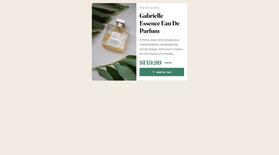
Product preview card component
#react#vanilla-extract#webpack

@OscarAnillo

Design comparison
SolutionDesign

Solution retrospective
I found dificult make it responsive with the media queries, is a field I have forgotten, need more practice with it.
Community feedback
- @wotanutPosted 6 months ago
An excellent attempt, well done. Here's how you can do better:
- Align the card itself to the centre of the screen. You can do this by adding this snippet to either your App class or HTML/Body
display: flex; align-items: center; justify-content: center;- Try not to use div's and prefer other semantic elements like <Section> or <Article> and include a <Main> as well for every document. Here's a couple of useful articles as to why it's important. Dev.to FreeCodeCamp
- Your media query needs adjusting to have effect on a slightly bigger screen or you need to increase your padding on your product text so it does not flow off the card.
- I think you can benefit from using a naming convention like BEM (Block, Element, Modifier) is beneficial because it makes your CSS more organized, readable, and easier to maintain. BEM helps you clearly understand the purpose of each class, avoid naming conflicts, and create reusable components, leading to a more scalable codebase. For more details.
Your media query's are very well written, and the attempt extremely polished, well done :)
0

Please log in to post a comment
Log in with GitHub
Join our Discord community
Join thousands of Frontend Mentor community members taking the challenges, sharing resources, helping each other, and chatting about all things front-end!
Join our Discord