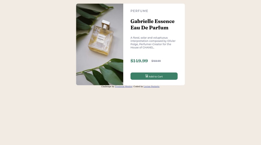
Design comparison
Community feedback
- @catherineisonlinePosted about 2 years ago
HI! Your solution looks nice though there are a couple of things you can improve which I hope will be helpful! 😊
I would add some transitions for active states (when colors change on hover). It creates more interactivity and makes the project look cooler. Active states can be done on buttons, links, titles which act like links, or anything else, you choose.
You can read more about it here, in case you haven’t done much of it: https://www.w3schools.com/css/css3_transitions.asp
The image with the alt "Cart icon" should be used more as a decorative image, rather than being attached to any content.
Alt attribute for the image is important in order to specify alternative text for the image in case it will not be displayed. Using alt attribute is good for not only accessibility but also SEO and for situations when the image is loading too slowly. If the image is just for decoration you can still write an alt attribute but leave it empty, such images don’t need any alt tag but you will need to also add aria-hidden=“true”. What aria-hidden does is that it removes the entire element from the accessibility tree.
If otherwise, you need to use an alt tag to describe the image. To write an alt tag you need to describe the content and purpose of the image and try not to use words like “picture of” or “image of”.
To make your container responsive you should change the media query for flex-direction because you set it to (min-width: 376px) but it doesn't fit the screen until 660px. So I would change flex-direction to row after 660px
Marked as helpful2 - @HassiaiPosted about 2 years ago
Replace<div class="card">with the main tag and <div class="attribution"> with the footer tag to fix the accessibility issues. click here for more on web-accessibility and semantic html
To center .card on the page, add min-height:100vh; display: flex; align-items: center: justify-content: center; or min-height:100vh; display: grid place-items: center to the body.
There is no need for a width value in .product-details-content , the padding value is sufficient.
In the media query give product-image-container and .product-details-container a width value of 50%, there is no need flex: 1; and height value in them
Use rem or em as unit for the padding, margin, width and preferably rem for the font-size for more on CSS units Click here
Hope am helpful.
Well done for completing this challenge. HAPPY CODING
Marked as helpful1
Please log in to post a comment
Log in with GitHubJoin our Discord community
Join thousands of Frontend Mentor community members taking the challenges, sharing resources, helping each other, and chatting about all things front-end!
Join our Discord
