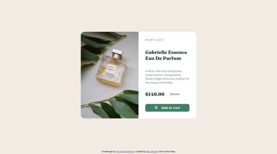
Design comparison
SolutionDesign
Please log in to post a comment
Log in with GitHubCommunity feedback
- @romila2003
Hi Bitu,
Congratulations 🎉 for completing another challenge, your Card component looks great, and it is great that you used flex to center the card. I have some suggestions/issues I want to address:
- It is important to use the correct semantics which I have mentioned in your previous challenge.
- To make your button look more like a button, you can use the
cursorproperty e.g.cursor: pointer; - According to the design, the price '$149.99' is quite large to make the price stick out and that it is on a discount.
- I noticed that you took a desktop-first approach however I would strongly suggest taking a mobile-first approach as it will be easier for responsiveness and changing/rearranging any elements within your container, as you increase the screen size.
Overall, great work and wish you the best for your future projects so keep coding 👍.
Marked as helpful
Join our Discord community
Join thousands of Frontend Mentor community members taking the challenges, sharing resources, helping each other, and chatting about all things front-end!
Join our Discord
