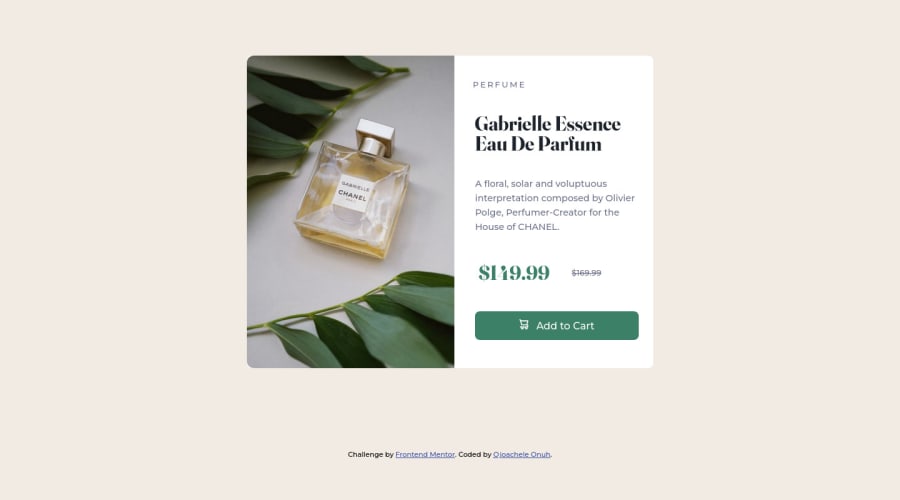
Design comparison
Solution retrospective
I need feedback on best practices, accessibility and anything else
Community feedback
- @correlucasPosted about 2 years ago
👾Hello Ojoachele, congratulations for your solution!
Your solution's design is really good, I don't think there's much to say about the design elements, but you can improve a bit the semantics.
Here's my tips for you:"
1.Your component is super responsive, but the only thing that are a bit off, is the pricing section that's poping out the container after
width: 280px
in the mobile version. I did a media query to fix that, see the code below:@media (max-width: 290px) { .price-tag { display: flex; flex-direction: column; }}
2.Instead of importing the image inside the css with
background-image
use<picture>
instead this way you wrap both desktop and mobile images together and set inside the html when these images should change. If you're not familiar to this tag, here's a quick guide:https://www.w3schools.com/tags/tag_picture.asp
3.Since you've used
section
for the text content block use it too for the image section replacing thediv
with<section>
.Thats It!
I saw that you've add the tag
webflow
have you done this site there? If yes, this is cool, I've used webflow in the past but the html and css output code wasn't so clean.Hope it helps and happy coding!
Marked as helpful1@AchelePosted about 2 years ago@correlucas Thank you for taking out time to go through my code and for the feedback, it was super helpful. I got to learn about the <picture> tag.
0 - @IanFariasPosted about 2 years ago
Hi!! Great solution! Congrats!!!
I have a sugestion that you work on:
-
In this img element [ <img src="images/icon-cart.svg" class="btn-img"> ] , the alt text is missing. It is a best practice for accessibility that each image has alternative text, even for decorative images. In the case of decorative images, which are not relevant to screen readers, you can hide them by adding an aria-hidden="true" attribute.
-
In <div class="attribution"> you can replace the div with a footer element, to improve code semantics
1@AchelePosted about 2 years ago@IanFarias Thank you for your feedback. I will fix it up
0 -
- @dtp27Posted about 2 years ago
Hi Ojoachele!
This looks really good!
I actually found that using Flexbox on the
body
instead of Grid helps to center it vertically on the page. I also really like how you used*
in your css to target all elements; it's something I hadn't thought of for the project but will definitely use it going forward.I did have a question for you: What were the considerations for making the image a background image, instead of inserting it directly into the HTML? I took the HTML route but wonder if there are advantages to the css route as well.
Happy coding!
Dan
0
Please log in to post a comment
Log in with GitHubJoin our Discord community
Join thousands of Frontend Mentor community members taking the challenges, sharing resources, helping each other, and chatting about all things front-end!
Join our Discord