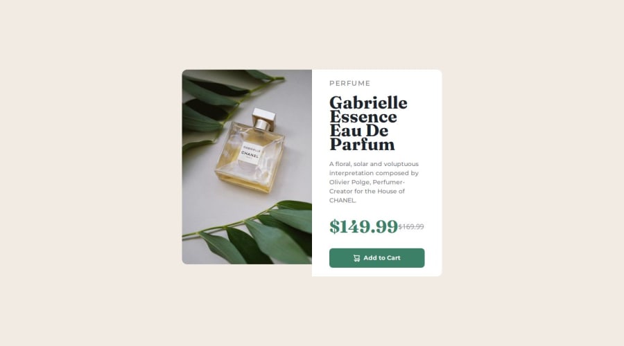
Design comparison
Solution retrospective
It's difficult to install Tailwind and Vue. There is an issue with git, and there is a lot of work to do before deploying vue. Do you have any advice on how to use Vue efficiently? I still use Vue like standard html. How can I improve? Please suggest. Thank you. the screenshot is not right, click the preview site!
Community feedback
- @LucianoDLimaPosted 9 months ago
Well done on completing this challenge!
There are a few SOLID principles for coding in Vue. I don't really know Vue, only React, but this article covers it. The one I use in react, and I see it is the same in Vue, is the Single Responsability Principle (SRP), where you have one component take care of a single thing, so you wouldn't end up with all your html in a single file for example.
Also, the link to your github page is broken at the moment, so I can't really see your folder structure
Regarding vue and tailwind installation, it is actually very simple to install if you use Vue with VIte. You should follow the steps in the documentation, you can find them here.
Marked as helpful0@01057057kimPosted 9 months ago@LucianoDLima github has fixed it. can you give me feedback? Thankyou
0@LucianoDLimaPosted 9 months ago@01057057kim sure!
Feedback 1: Regarding semantics, currently your structure looks like this
<body> <div> <main> <section> </section> <section> </section> </main> </div> </body>
The correct approach would be swap the div with the main. Also, section is used incorrectly here.
This project consists of a single card (so one section), so you shouldn't be using section tag to separate the image from the text, just use div for that. I know we have the stigma against divs, and trying to not use it as much as possible, but it is also important to not use the other tags incorrectly as that can hurt SEO and accessibility pretty bad. So the corrected structure would be:
<body> <main> <div> <div> </div> <div> </div> </div> </div> </main>
Do bear in mind the first div can be swapped to either section or article depending on the context. There are quite a few articles on it, like this one where you can see more about the difference between the tree.
Feedback 2: Your second section has a
<h2>
followed by a<h1>
. You should always start with a<h1>
, always. This also ensures better SEO and accessibility. Also remember that you can only have one<h1>
but you can have multiple of the others if used properly. So even if perfume is a smaller font, it should still be<h1>
because it is the main headingFeedback 3: The add to card button is currently wrapped by an anchor tag,
<a>
. The<a>
tag should only be used if you are redirecting the user to another page, or section of your website. If the button has an action, it should be labled<button>
, in this case this button has the action to add an item to a cart, that's why it should be a button and not an anchor tag.Hope it helps! The design looks very good so well done on replicating that!
Marked as helpful0
Please log in to post a comment
Log in with GitHubJoin our Discord community
Join thousands of Frontend Mentor community members taking the challenges, sharing resources, helping each other, and chatting about all things front-end!
Join our Discord